

Ukrainian National Women’s League of America
Nonprofit Rebrand

Concept
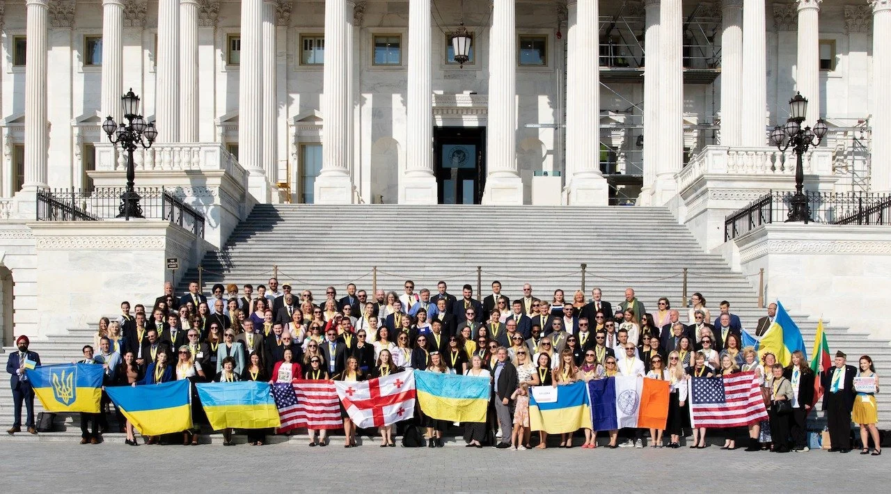
The Ukrainian National Women’s League of America is a non-profit advocacy, humanitarian aid, and Ukrainian culture protection group.
Challenge
For my Design Studio I class at Austin Community College, I got to be on a team of 5 approached to rebrand the UNWLA. For this rebrand, we were asked to help modernize the logo without adding or removing any elements from they currently had. A challenge our team was up for!
Initial Thoughts
Never have I ever felt more honored to work with an organization before this one! Not only was I amazed and so excited that a century-running, national org was looking to us for such a big design project, but the passion expressed from all involved with UNWLA immediately showed my team and I just how sincere and impactful this group is!

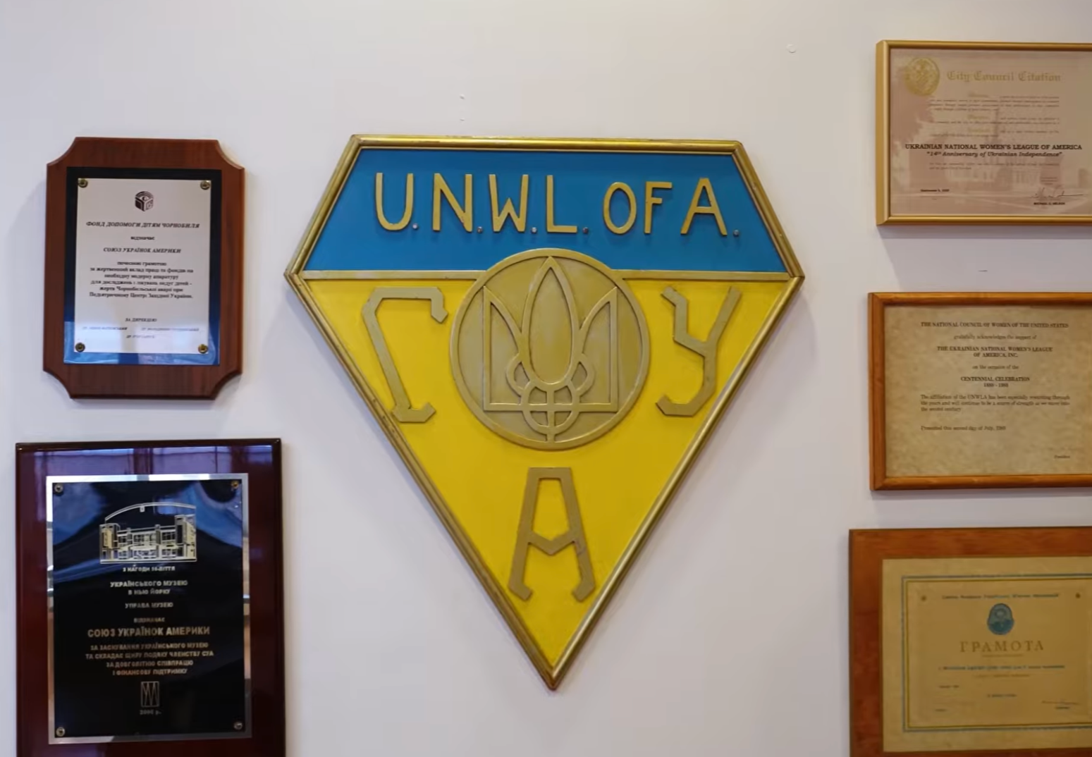
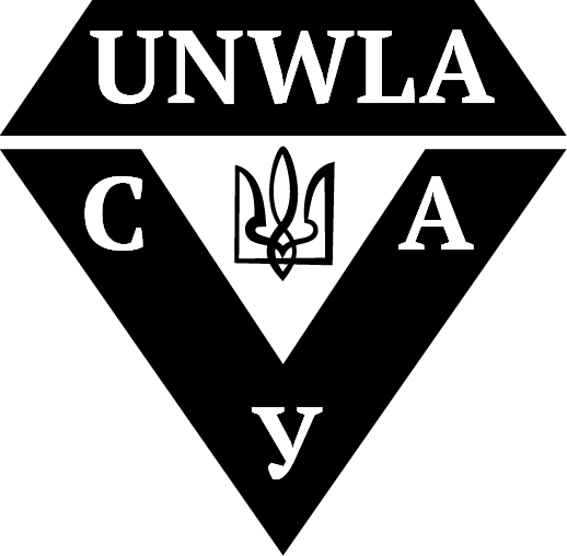
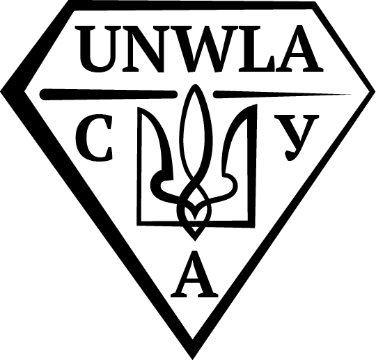
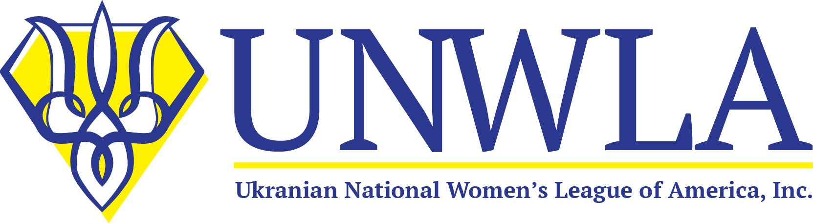
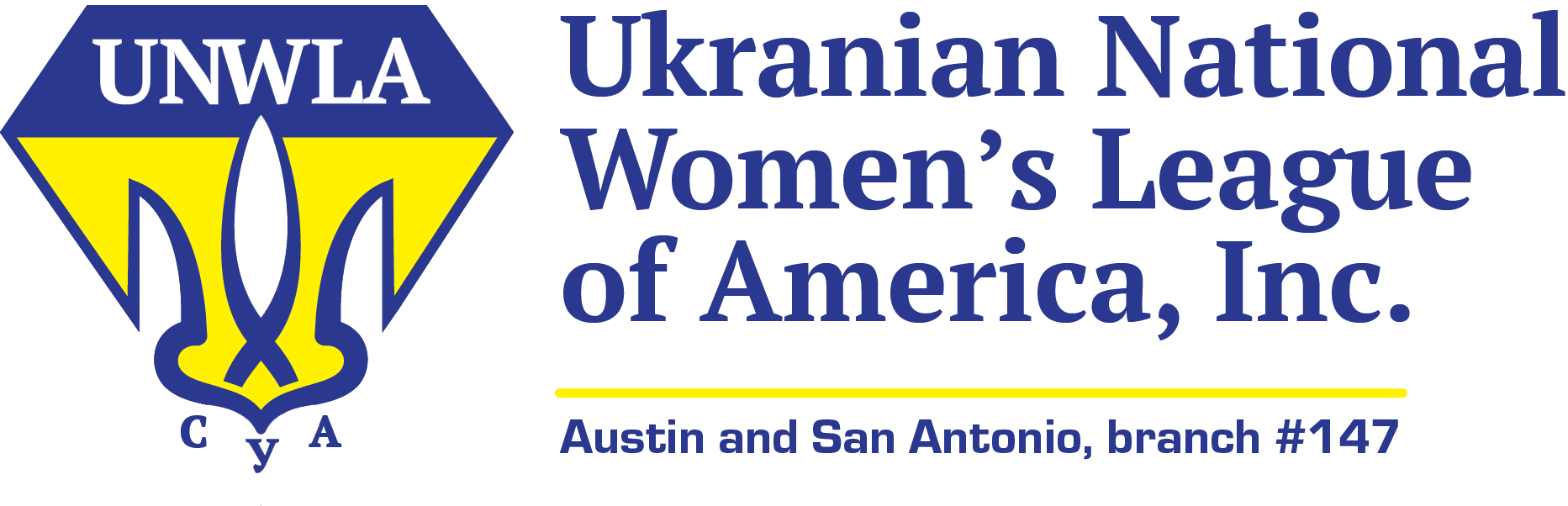
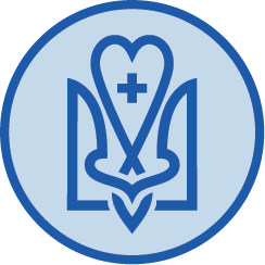
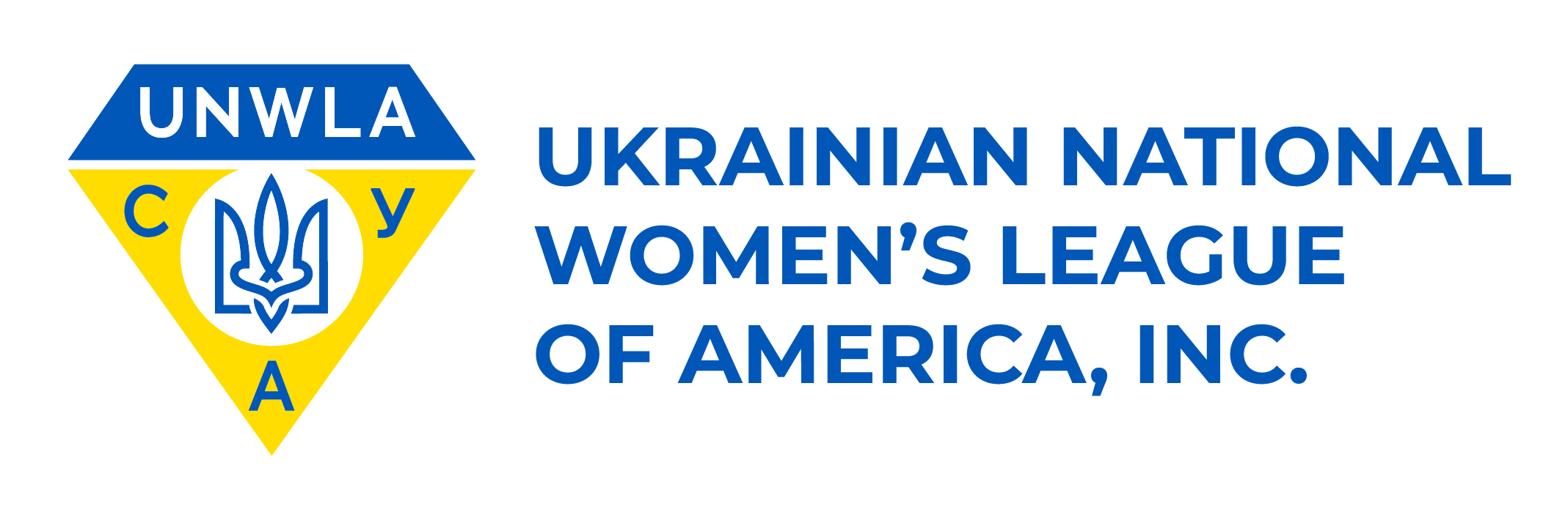
Original Logo

As an or that’s been running for over a century, who’s current logo still takes after the seal created at founding, it made sense why they didn’t want to completely change it. This meant in our final logo we must include both English and Ukrainian synonyms in the same position, a blue trapezoid on top of a yellow triangle, and the Ukrainian trident (called a tryzub in Ukrainian) in the middle.
Inspiration
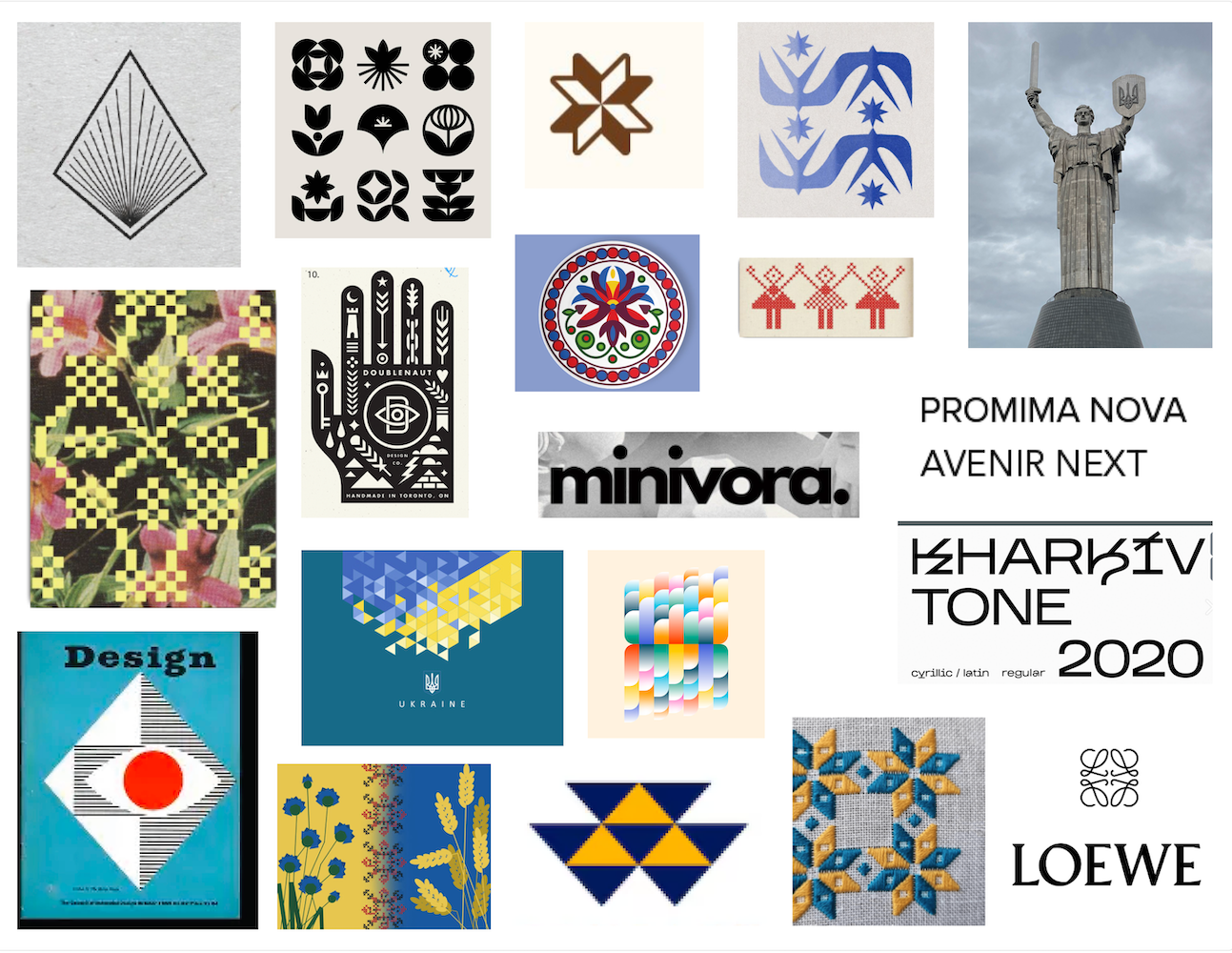
To create a logo that captures the modern impact of the org along with it’s long standing heritage, we looked to crafts like embroidery and linocut printmaking, which connect modern shape-based designs with long running traditions. The Loewe logo was specifically a favorite, demonstrating timelessness and modernity.
Sketches
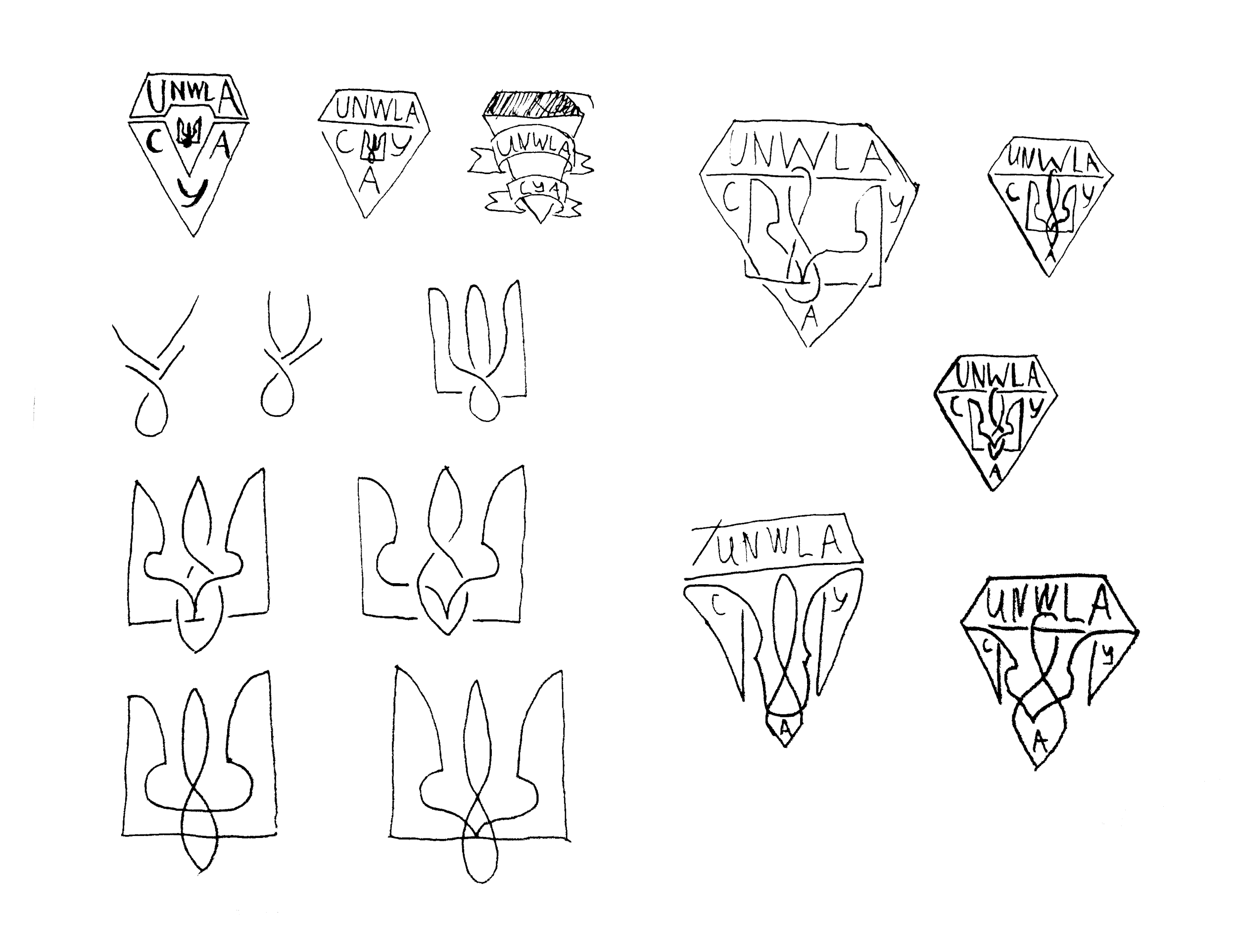
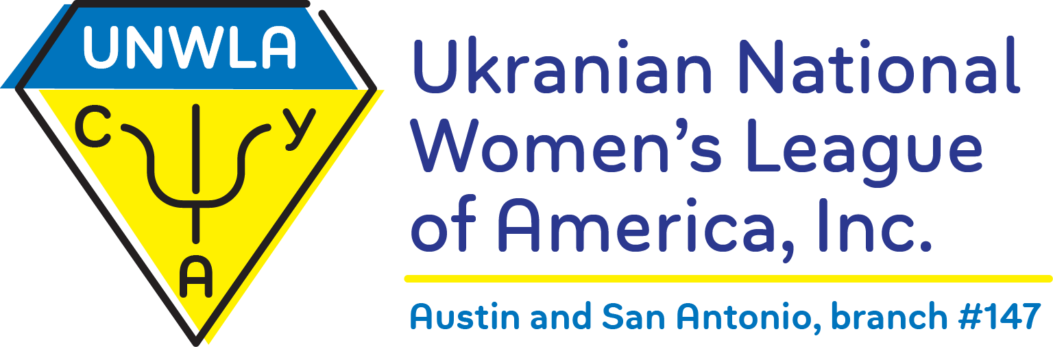
In my sketches, I set to work looking for the changes I could make. The piece of the logo we had the most bandwidth to change was the tryzub. I experimented with different ways of interweaving the lines like a Celtic knot, even trying to intertwine the lines of the tryzub with the shapes around it.
Digital Drafts
Round 1


As I went digital, I found one form of the tryzub that worked really well in the Celtic knot line style, so I used this version of the trident in all of my drafts. Besides that, I played with different line weights, different typefaces, and different interpretations of the the very clearly defined rules… (I couldn’t help it)
Digital Drafts
Round 2
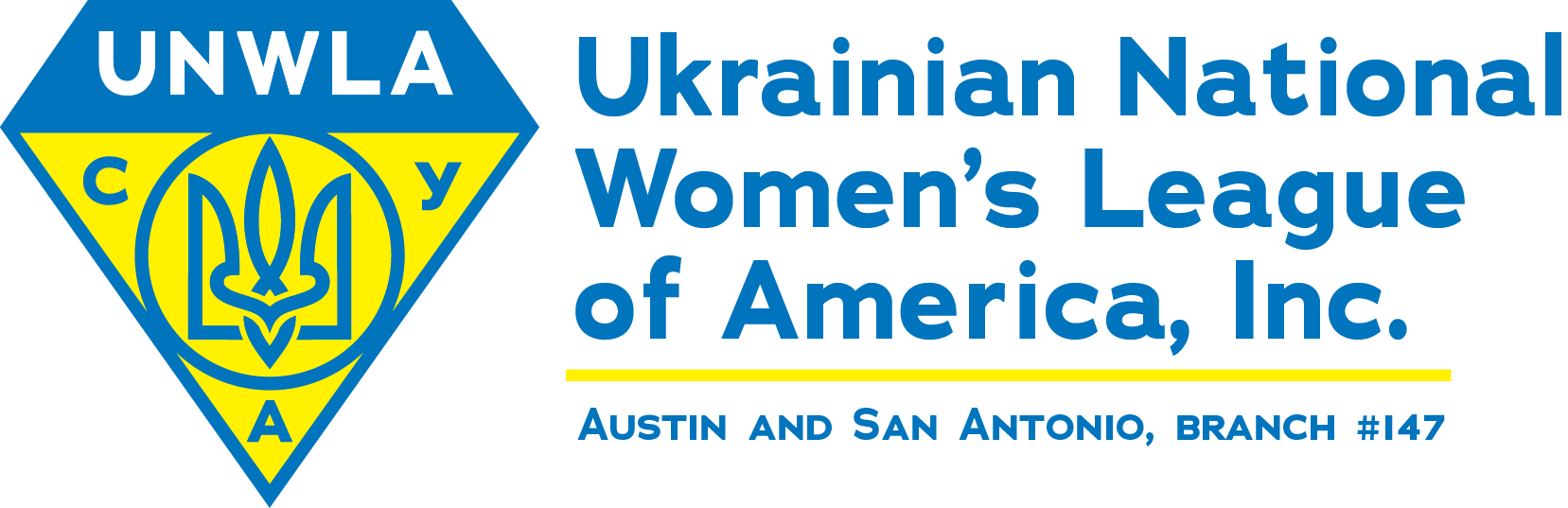
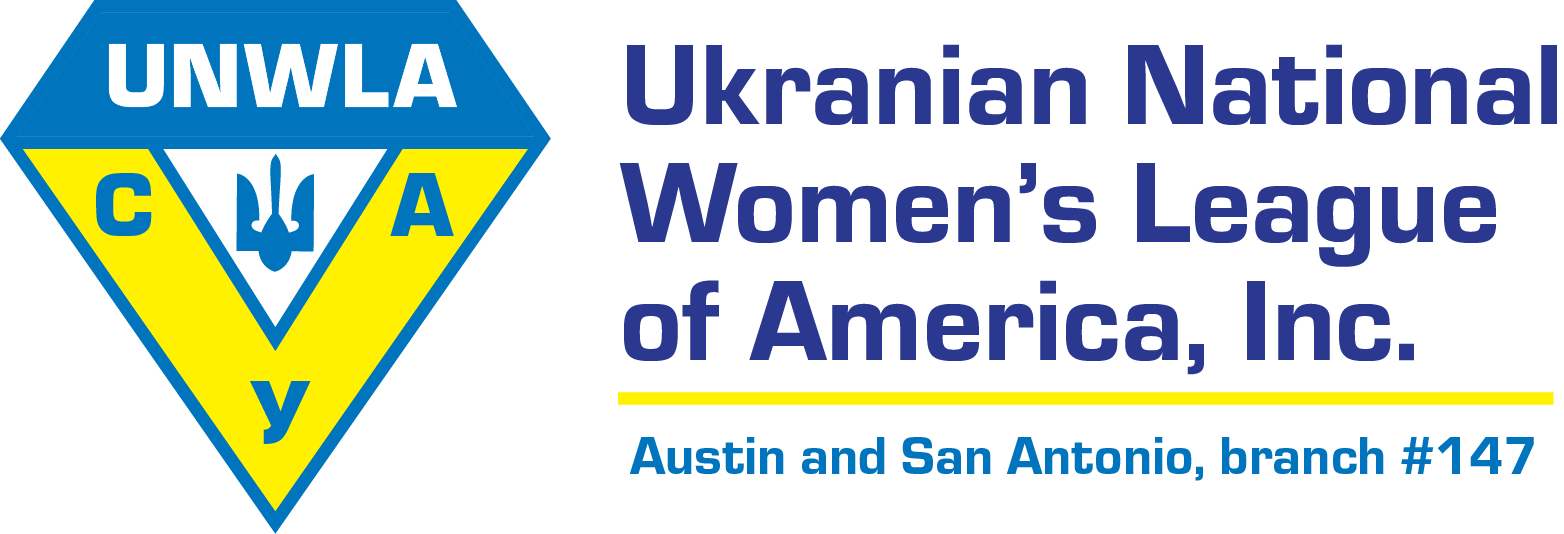
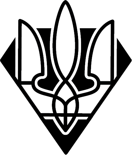
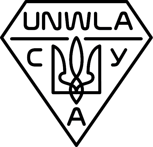
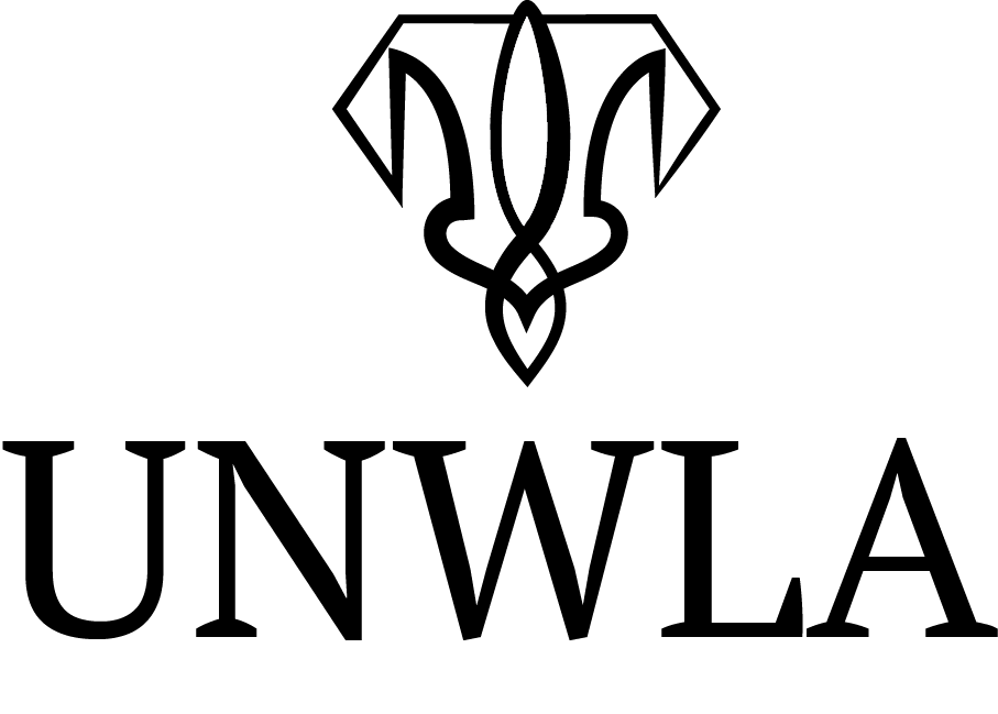
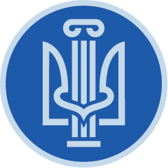
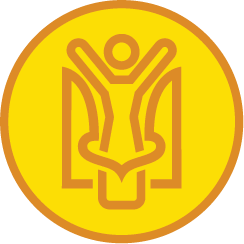
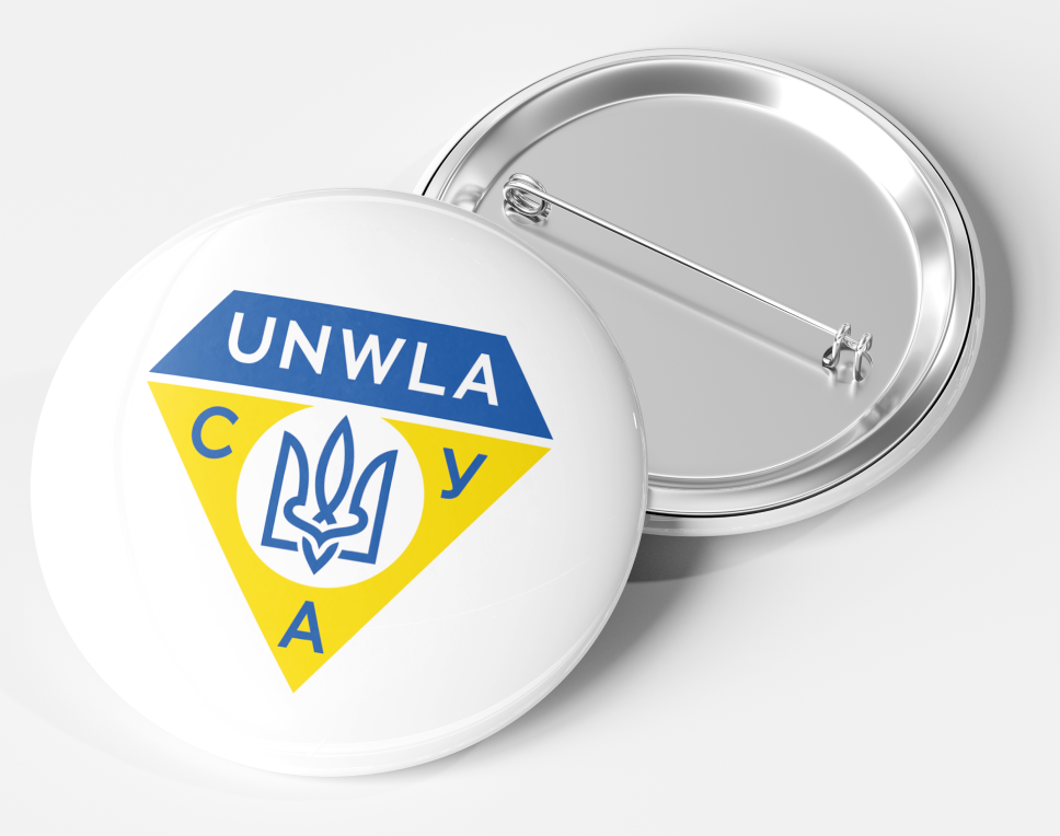
With my second round of digital drafts, I stumbled upon my personal favorite solution, one where the tryzub is scaled up, breaking through the boundary above it and combining with the triangle it is encapsulated in. We called this solution “Step Leader”. After presenting this logo, along with 4 made by other teammates, we were eventually able to iterate down a solution that did not break the rules nearly like this one, yet kept the updated tryzub.
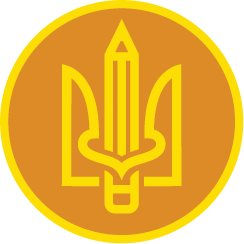
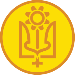


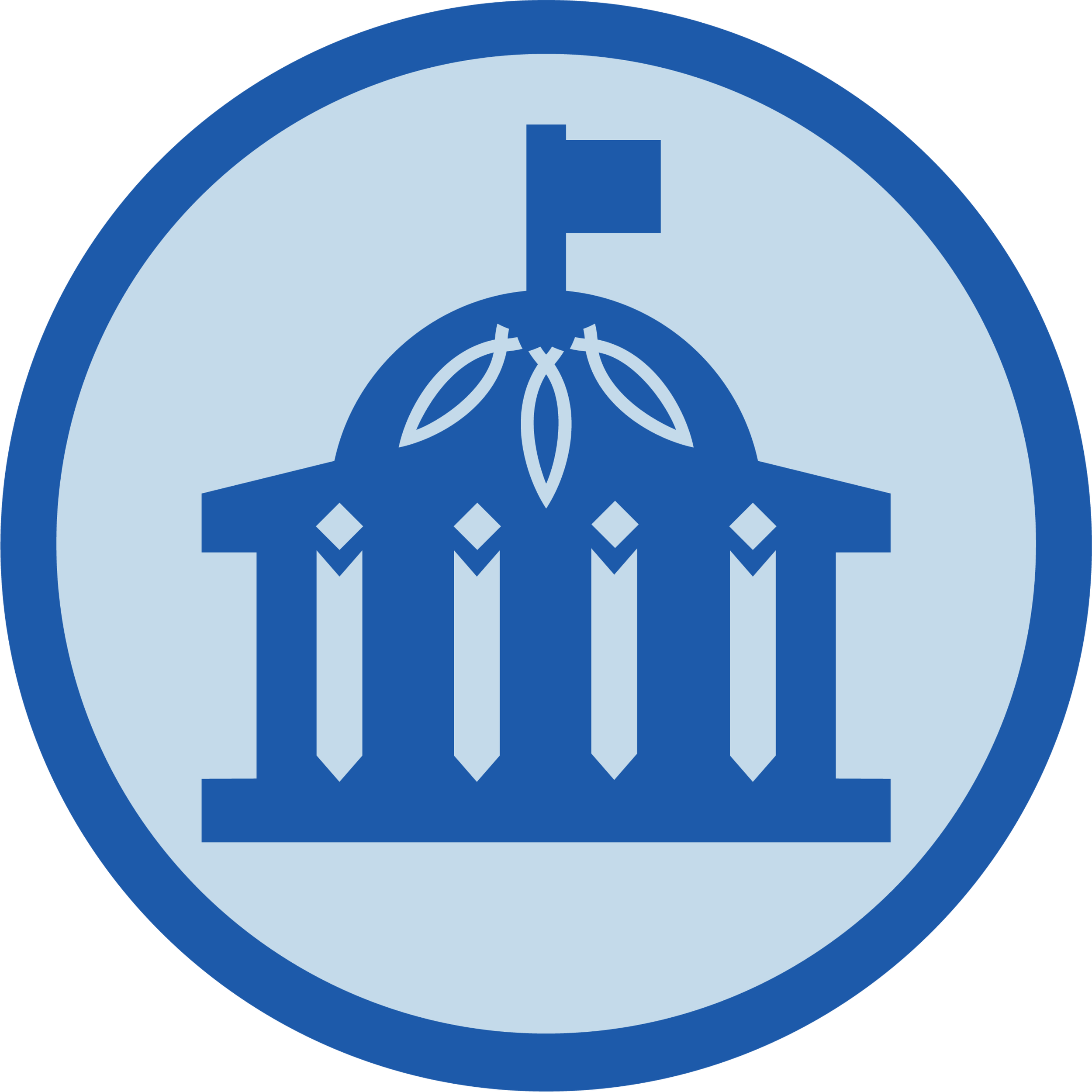
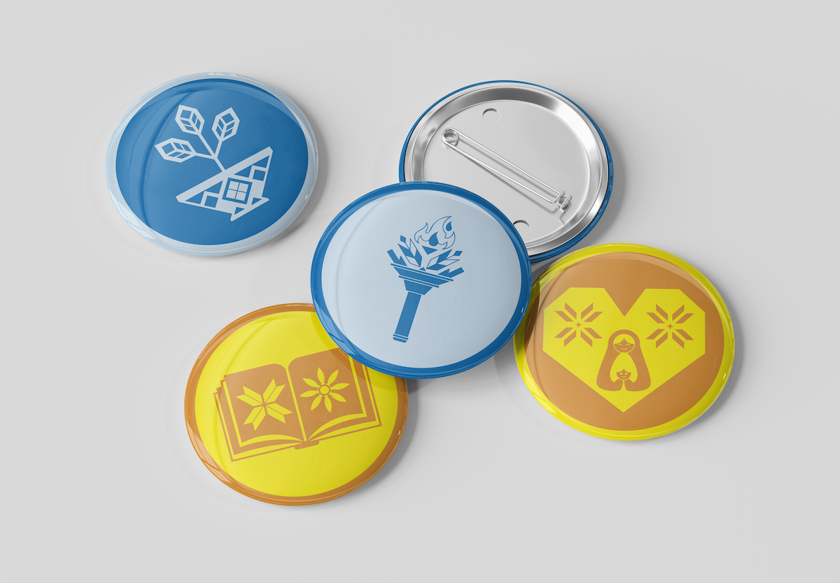
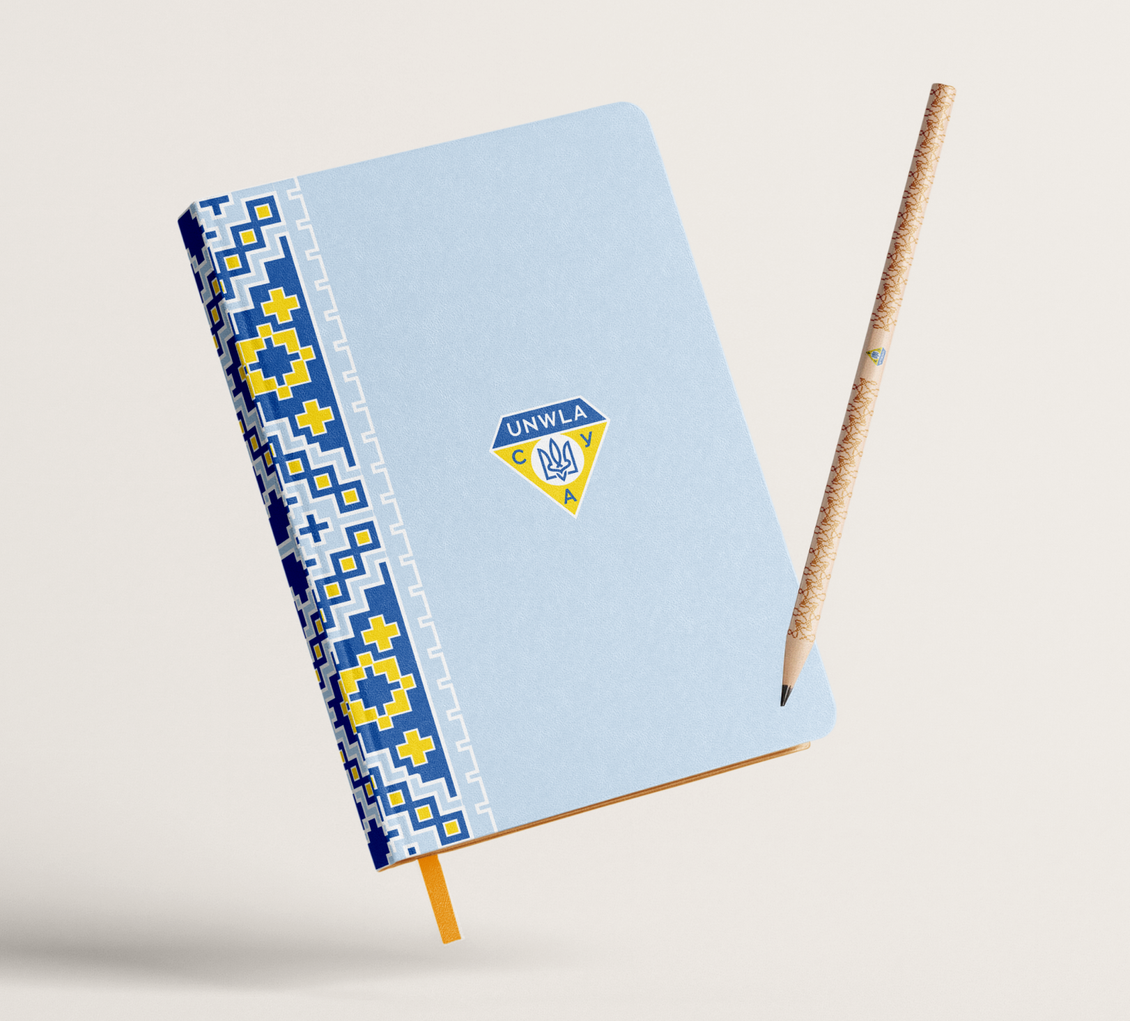
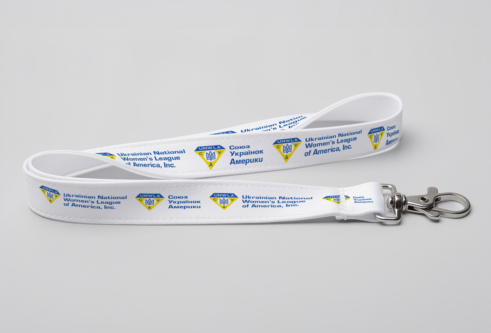
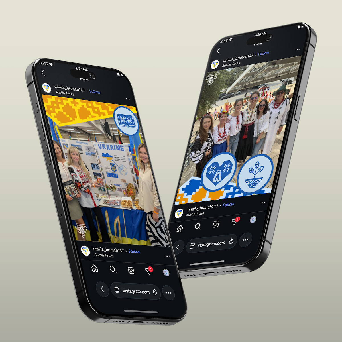
Along with a logo, we provided them with icons to match their 4 tenants, Advocate, Educate, Cultivate and Care, along with other templates and assets. We made them in 3 different styles, “Intertwined” and “Iconic” were both made by me and “Vyshyvka” was made by my teammate, Rev.
Finals
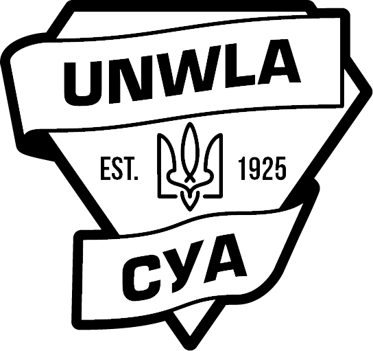
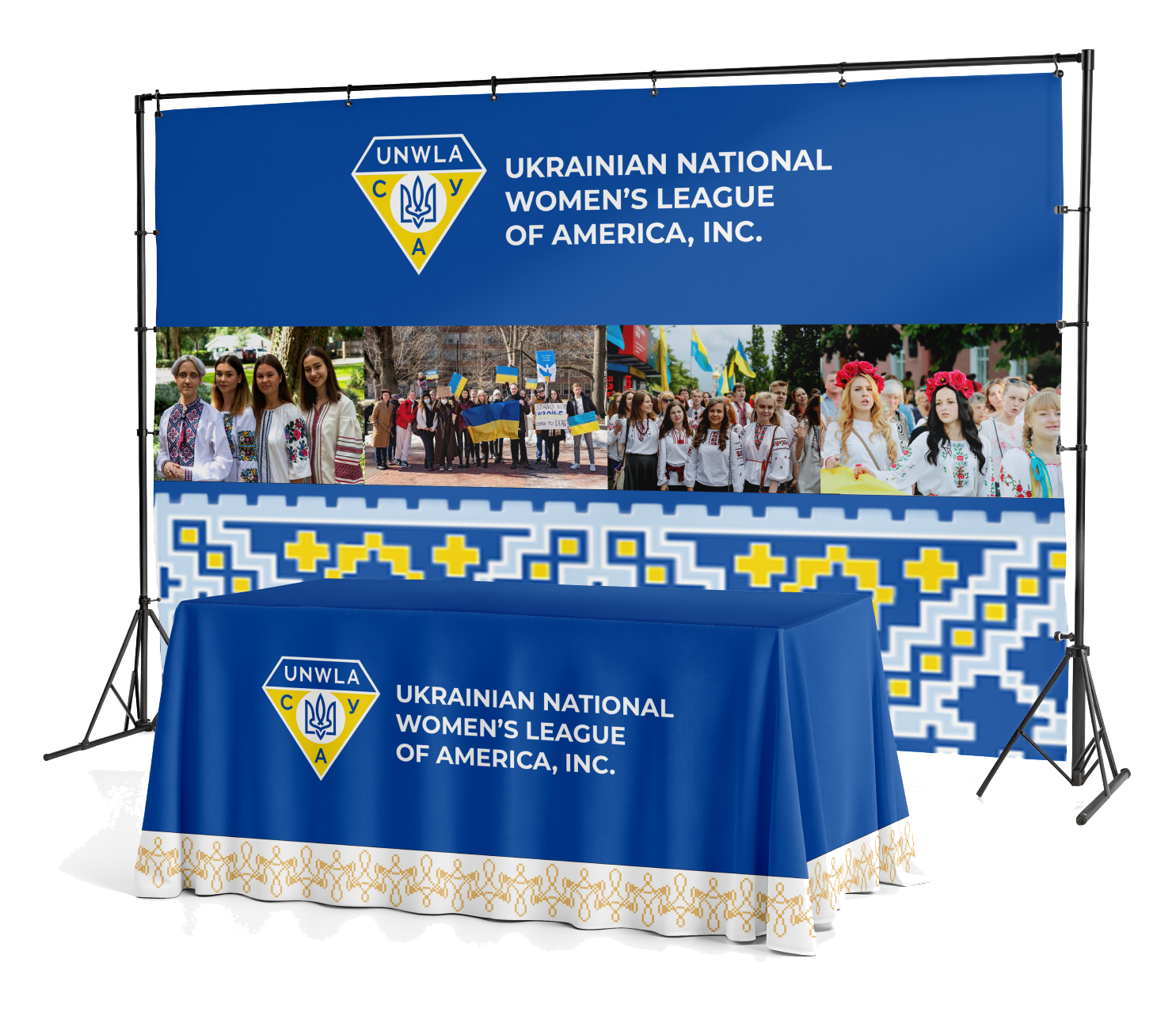
UNWLA ended up choosing a shape based logo put together by Rev, who incorporated my interweaving tryzub. In one of our meetings with members of the UNWLA, we were told that, without the original harsh outline, the logo really expressed a sense of freedom. A big goal of this project was to create a unified brand identity even between branches that span nationwide. To best solve this, we created templates for social media posts.
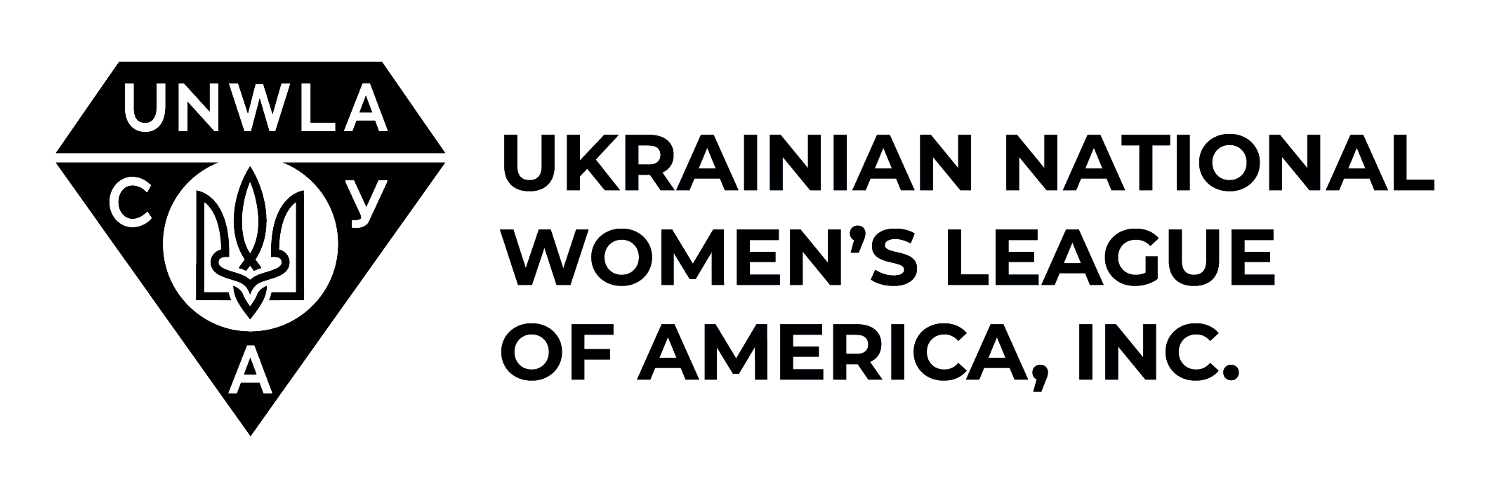
Two Color Logo
One Color Logo
Black and White Logo on White
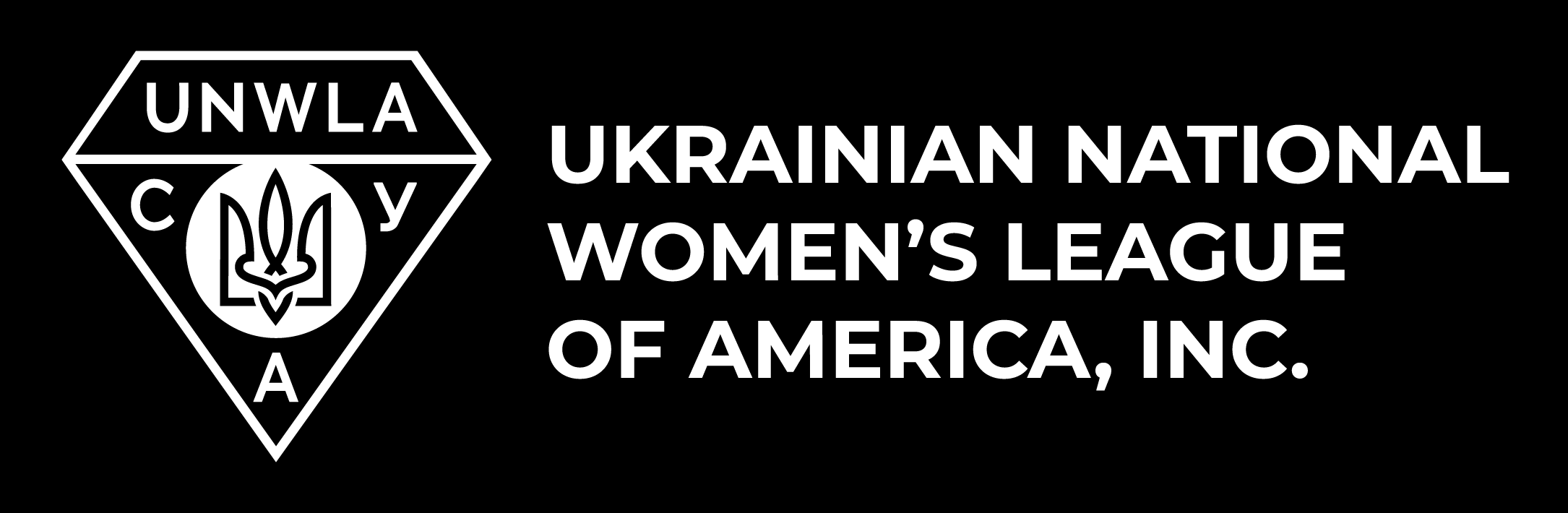
Black and White Logo on Black
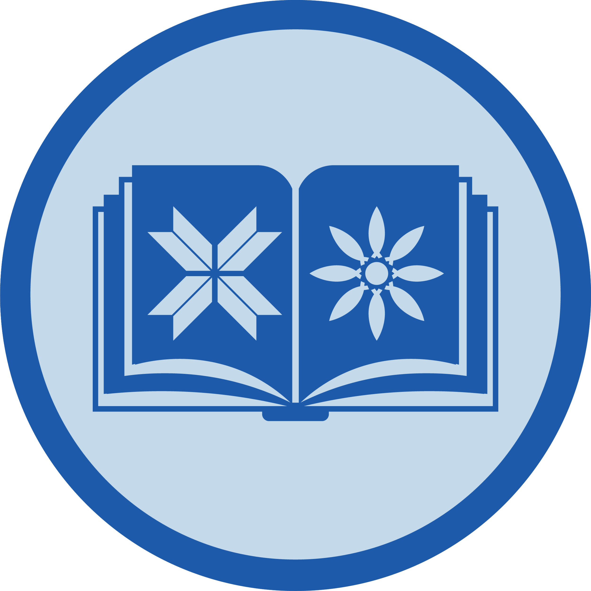
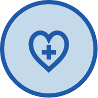
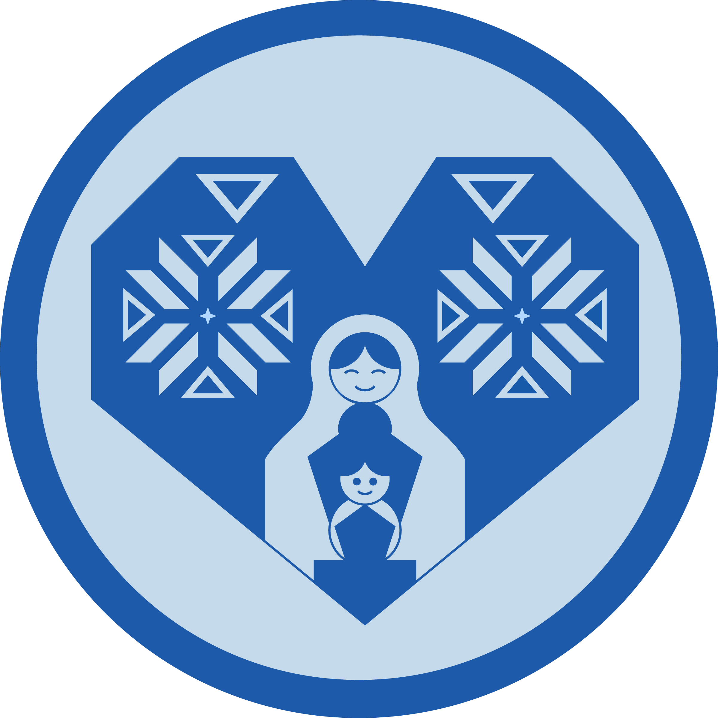
Educate Icon
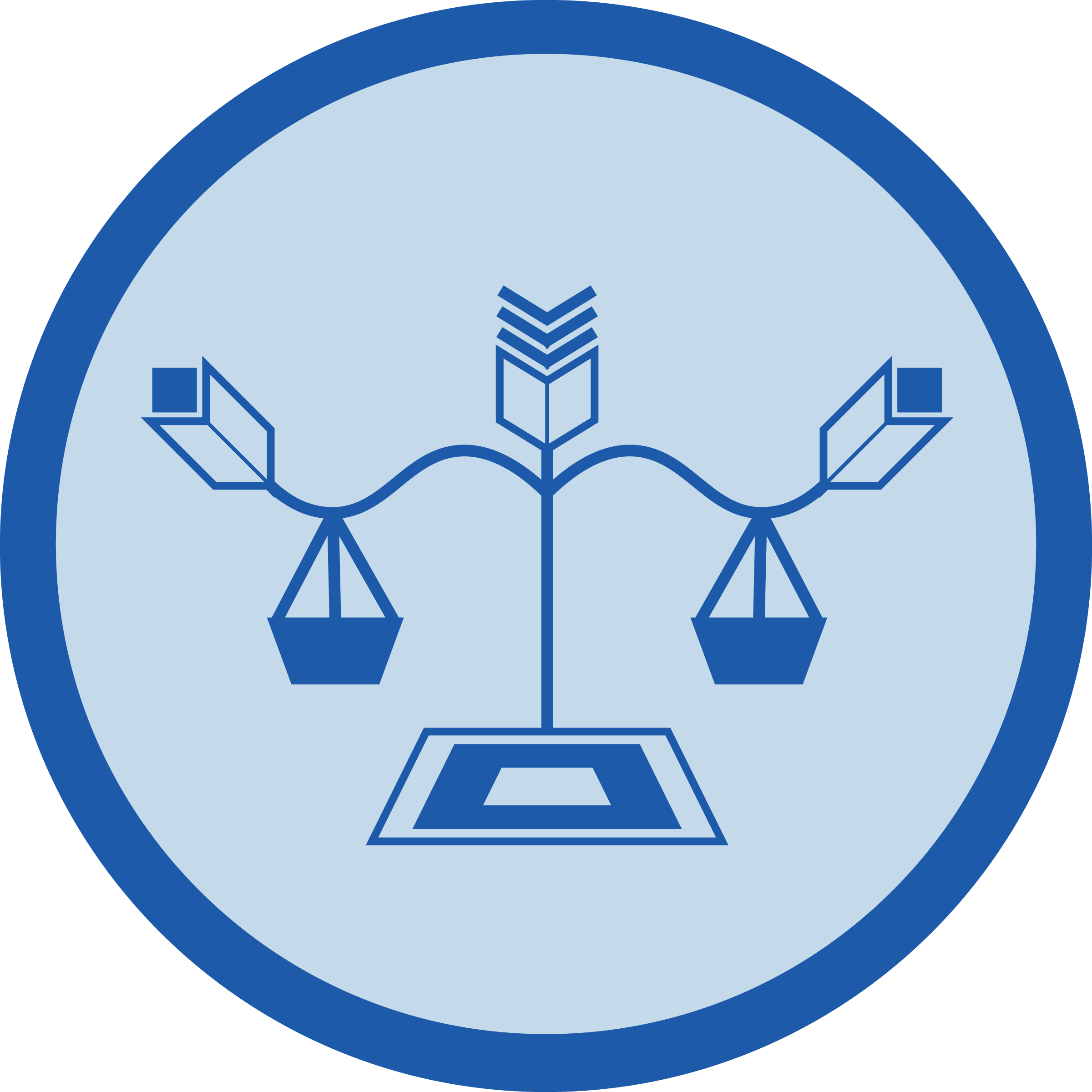
Advocate Icon
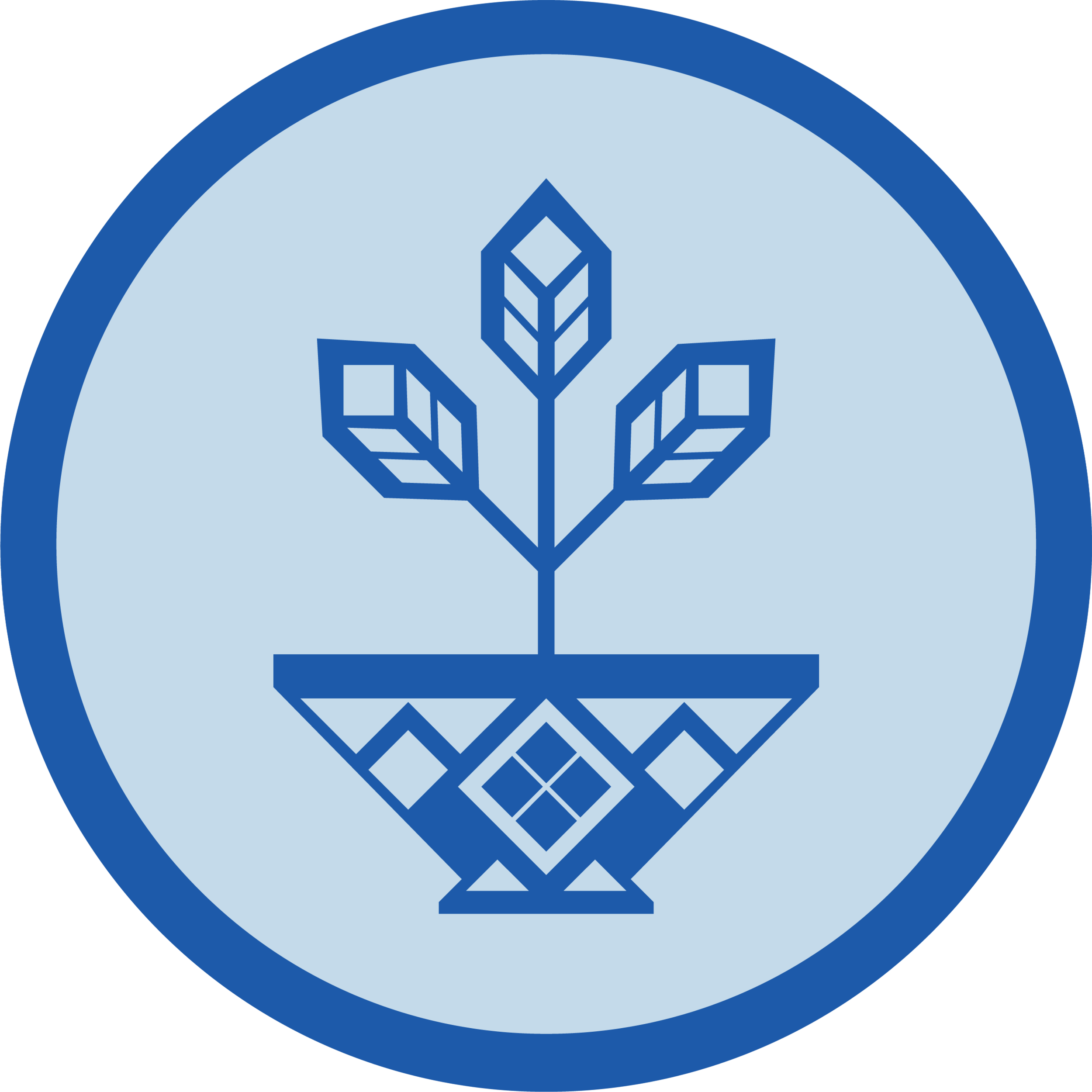
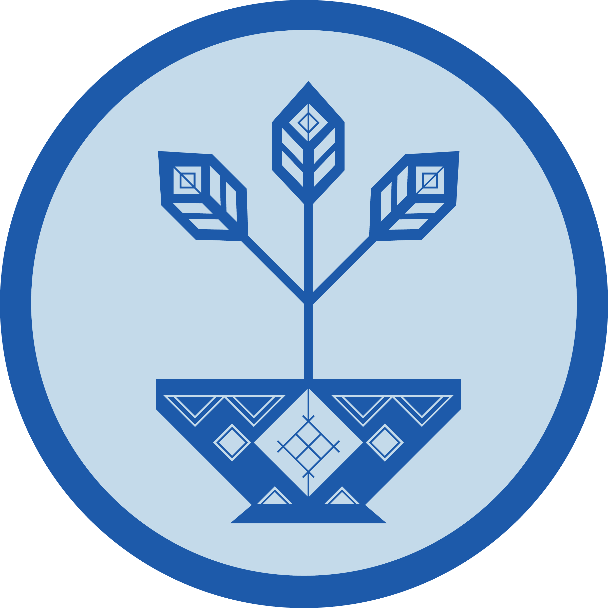
Cultivate Icon
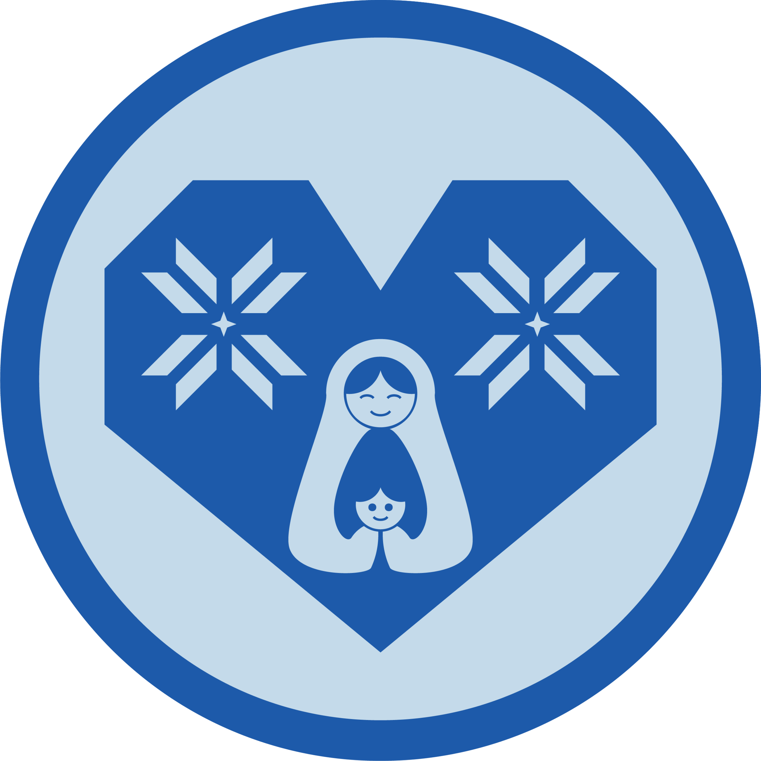
Care Icon
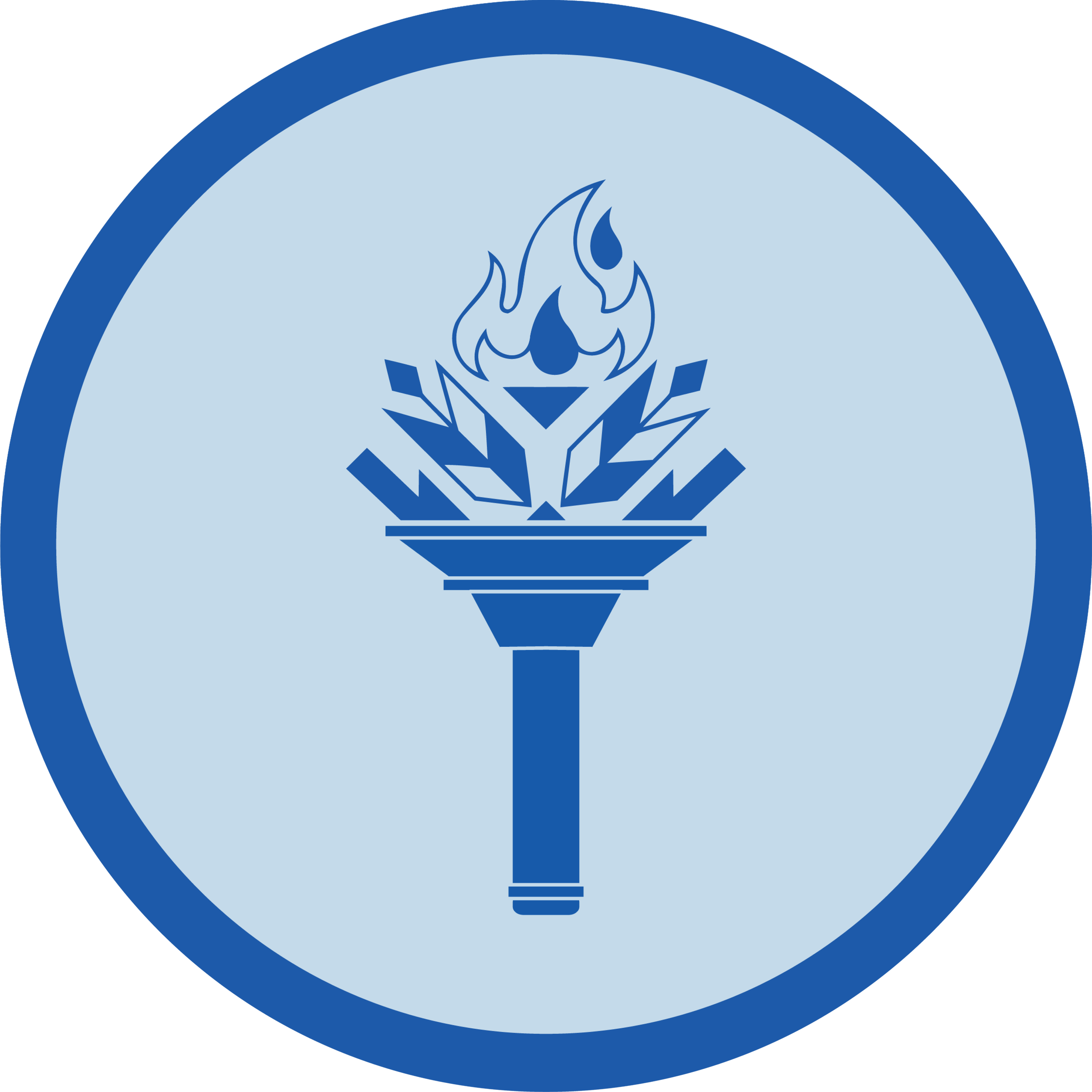
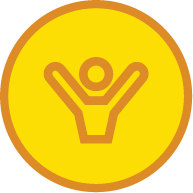
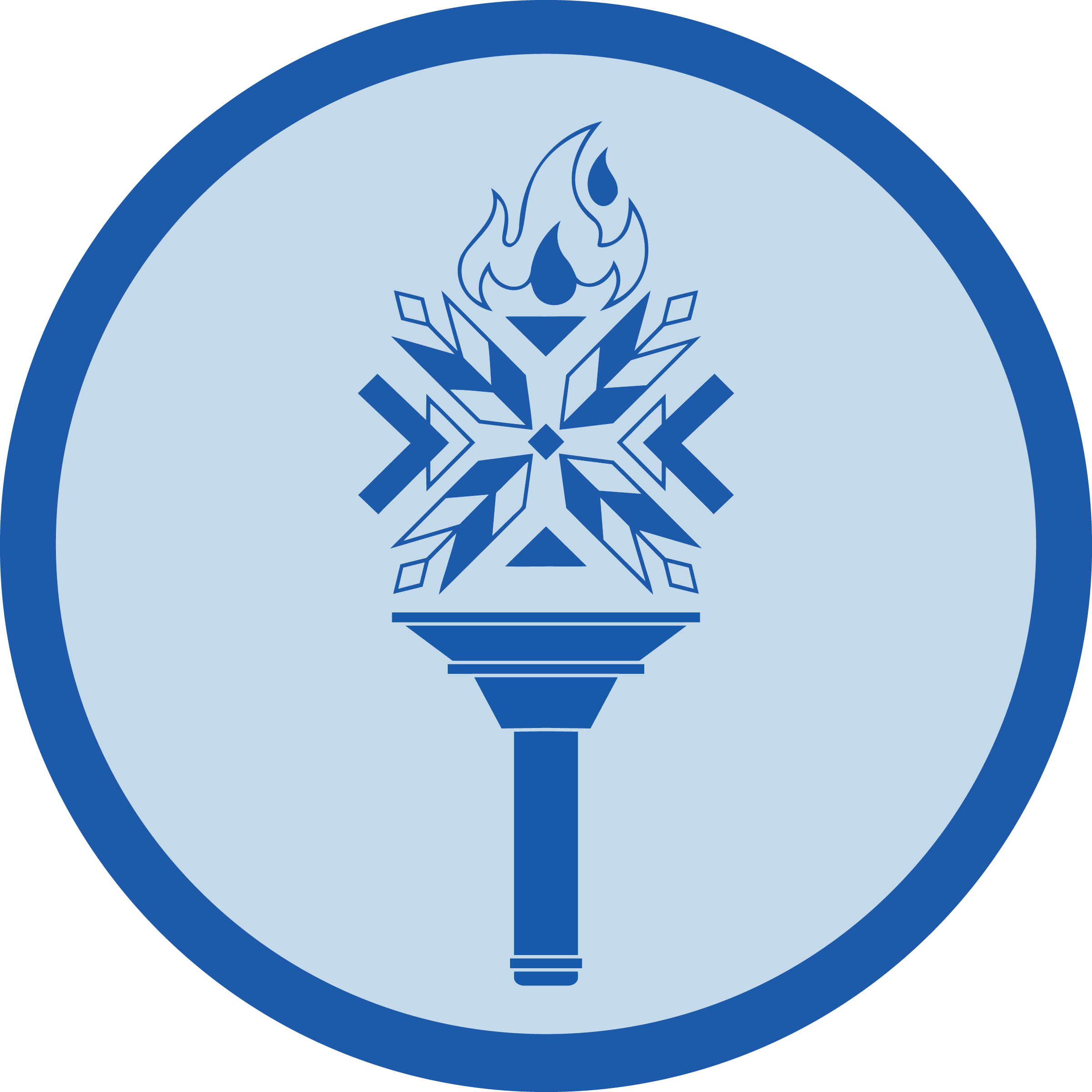
Lead Icon
Reflection
I won’t lie, this project felt like an overwhelming challenge at first, updating a logo without being able to change the fundamental elements of it. This very challenge, however, ended up being the reason I learned so much from this project! Even with the limitations, it was fruitful to push the boundaries. When the president of the UNWLA saw “Step Leader,” her immediate reaction was laughter! It was so against what she was expecting, that it almost seemed to hit like a punchline. Honestly, that is what felt like ultimate success to me, the way the members of the UNWLA so genuinely loved the updates we made to their logo.
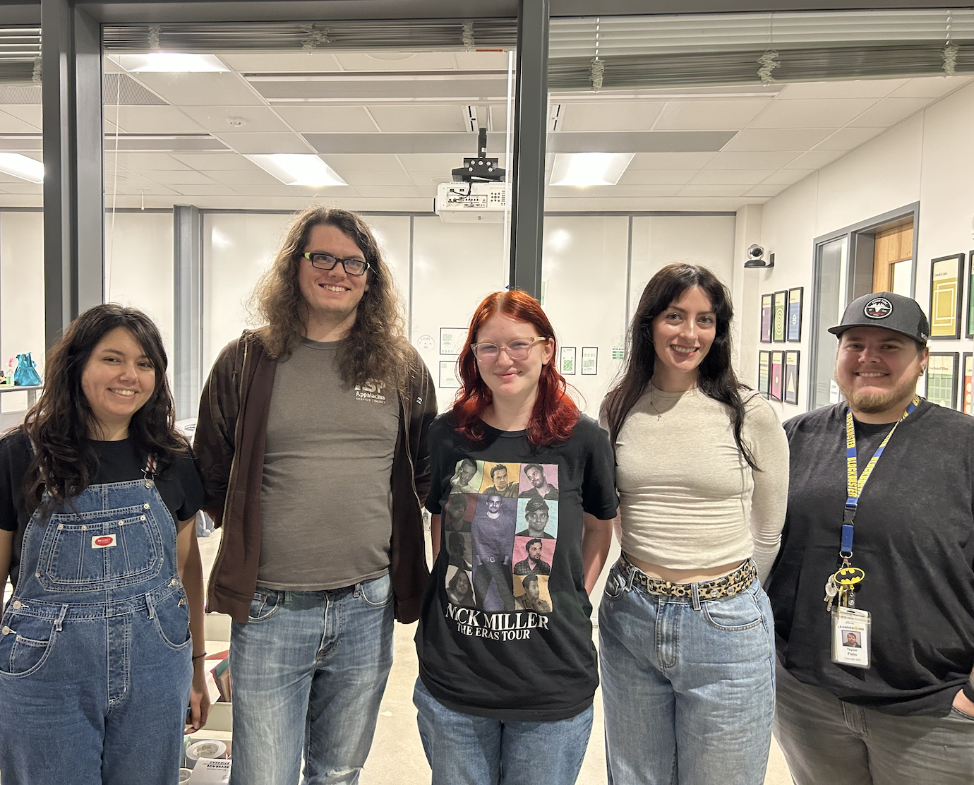
I’m so happy I got to be a part of this rebrand, and got to be on such a strong team of designers: Maleny Romero, Haley Foor, Katherine Taylor and Taylor “Rev” Revering.