


The Defensive Driver Series
Online Course Branding


Concept
The Defensive Driver Series is a concept online defensive driver course, written with a contiguous plot and fleshed out characters that people can get invested in.
Challenge
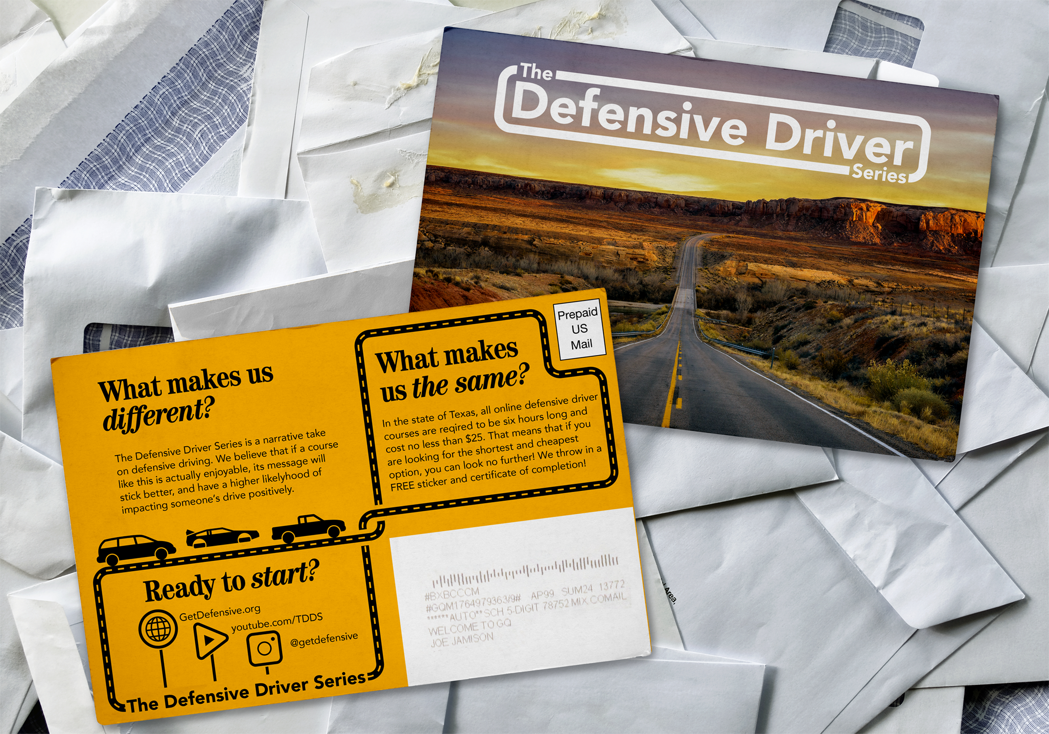
To create a brand system and marketing scheme, including mailers, billboards, iconography and certificates of completion.
Initial Thoughts
Good branding is critical in the online defensive driver market because, according to Texas state law, every course must be the same length and same cost, meaning theres no competition for shortest or cheapest course. In many ways, this series needs to have a mass appeal and sell itself as the best option on a truly level playing field.

Inspiration

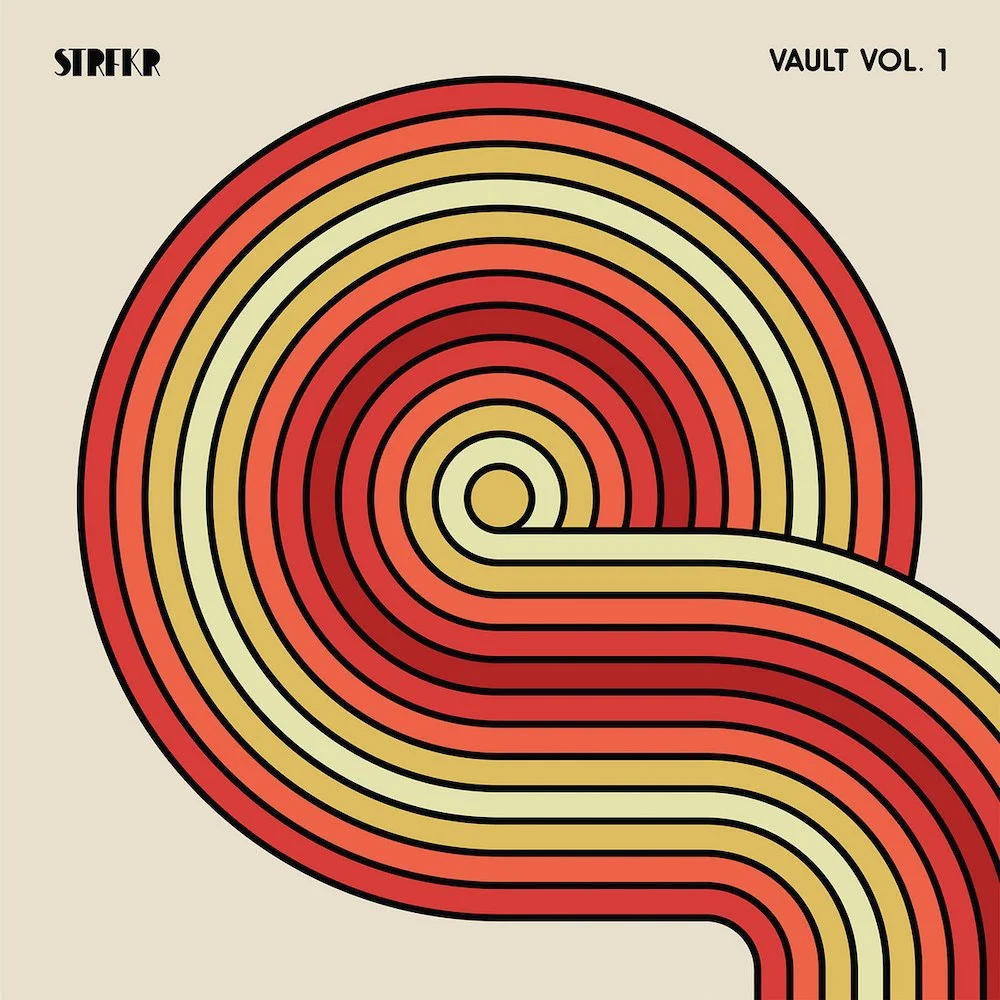
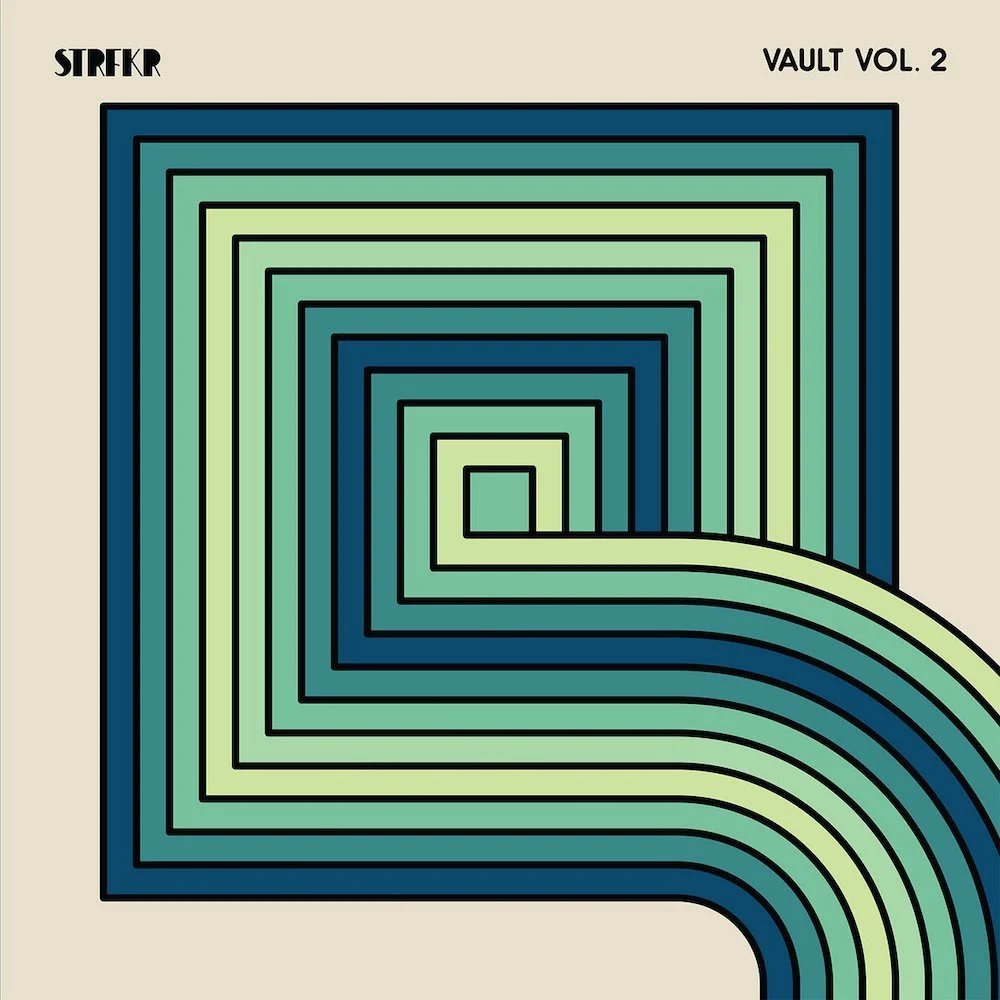
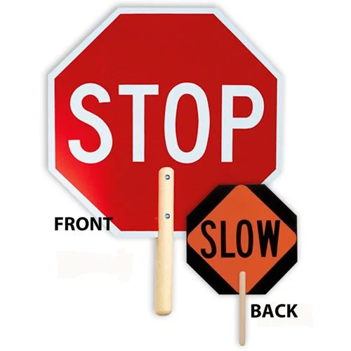
My biggest visual inspiration came from the album artwork of the music that will score the course. The feeling of movement from this amalgamation of lines gave me the idea of using a line as a symbol for the narrative through-line of the whole project. Along with the album art, I took a lot of inspiration from road signage.
Digital Drafts
Round 1
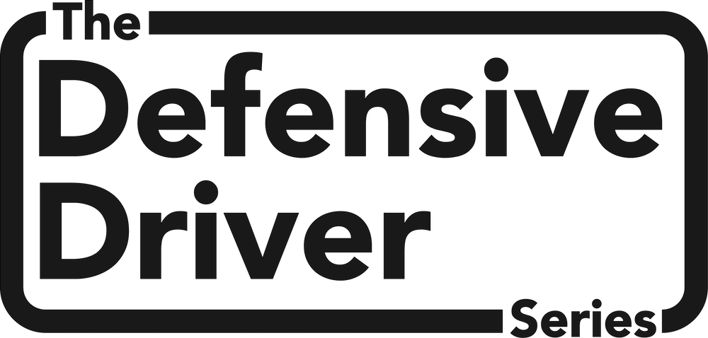

I tried a few different versions of the main logo and found that the most effective solution was the simplest. No iconography, just lines and type.
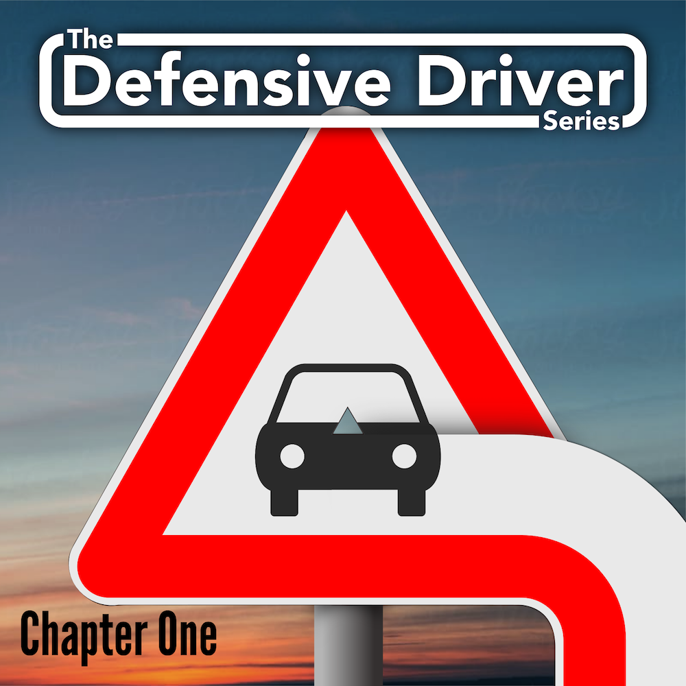
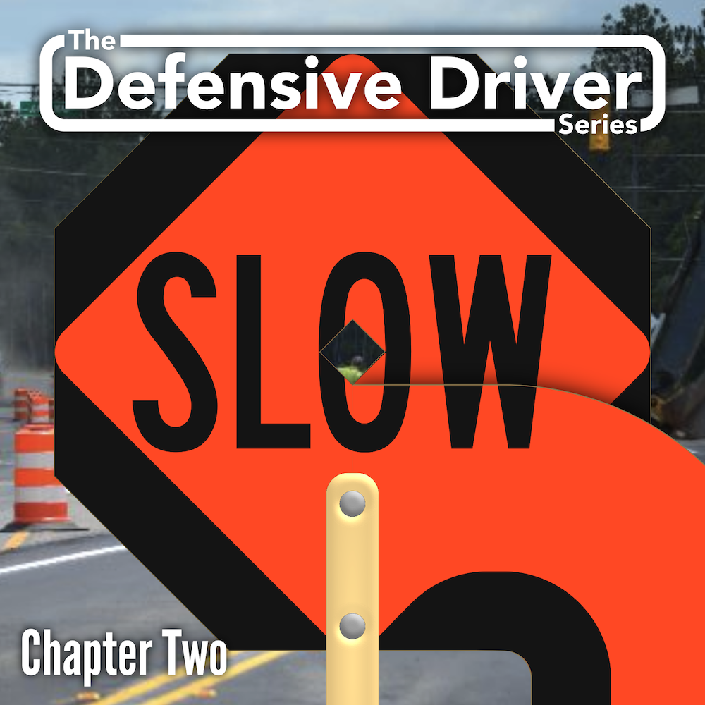
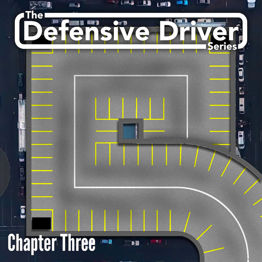
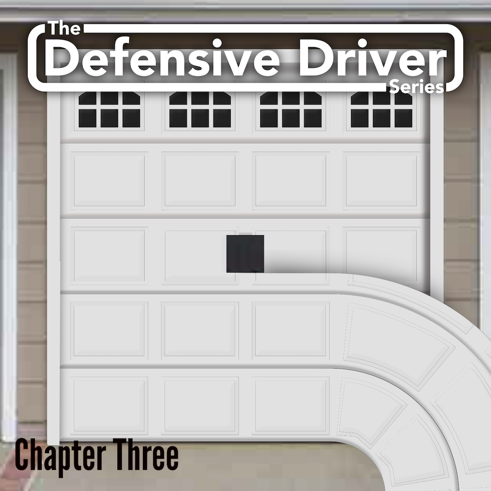
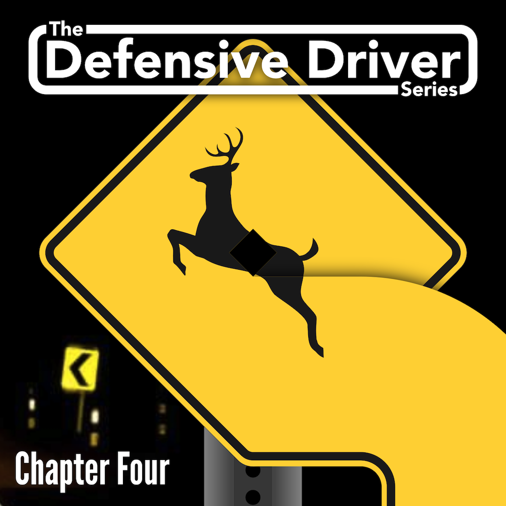
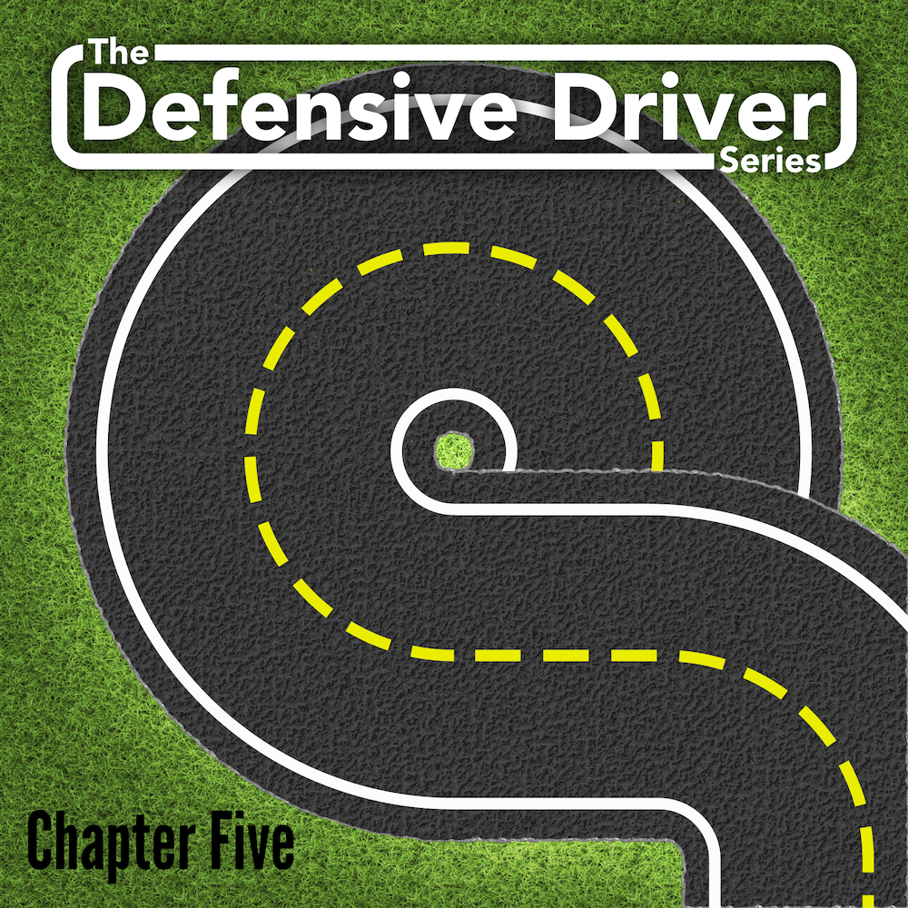
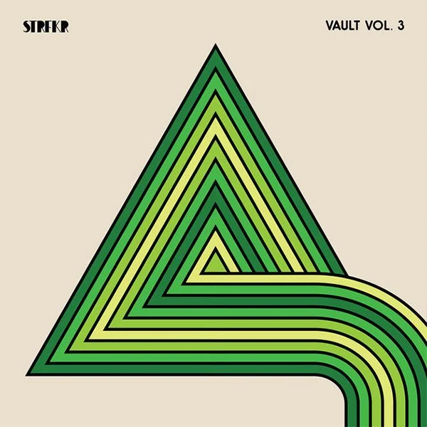
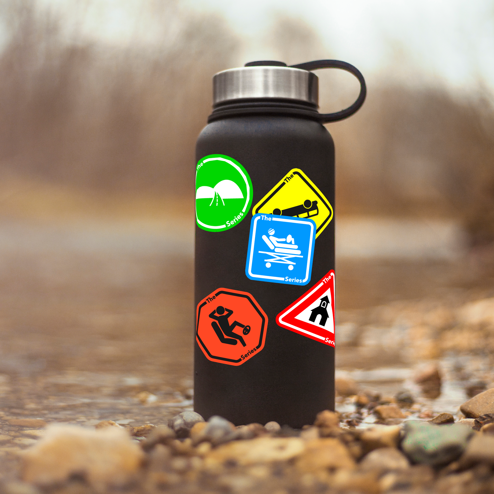
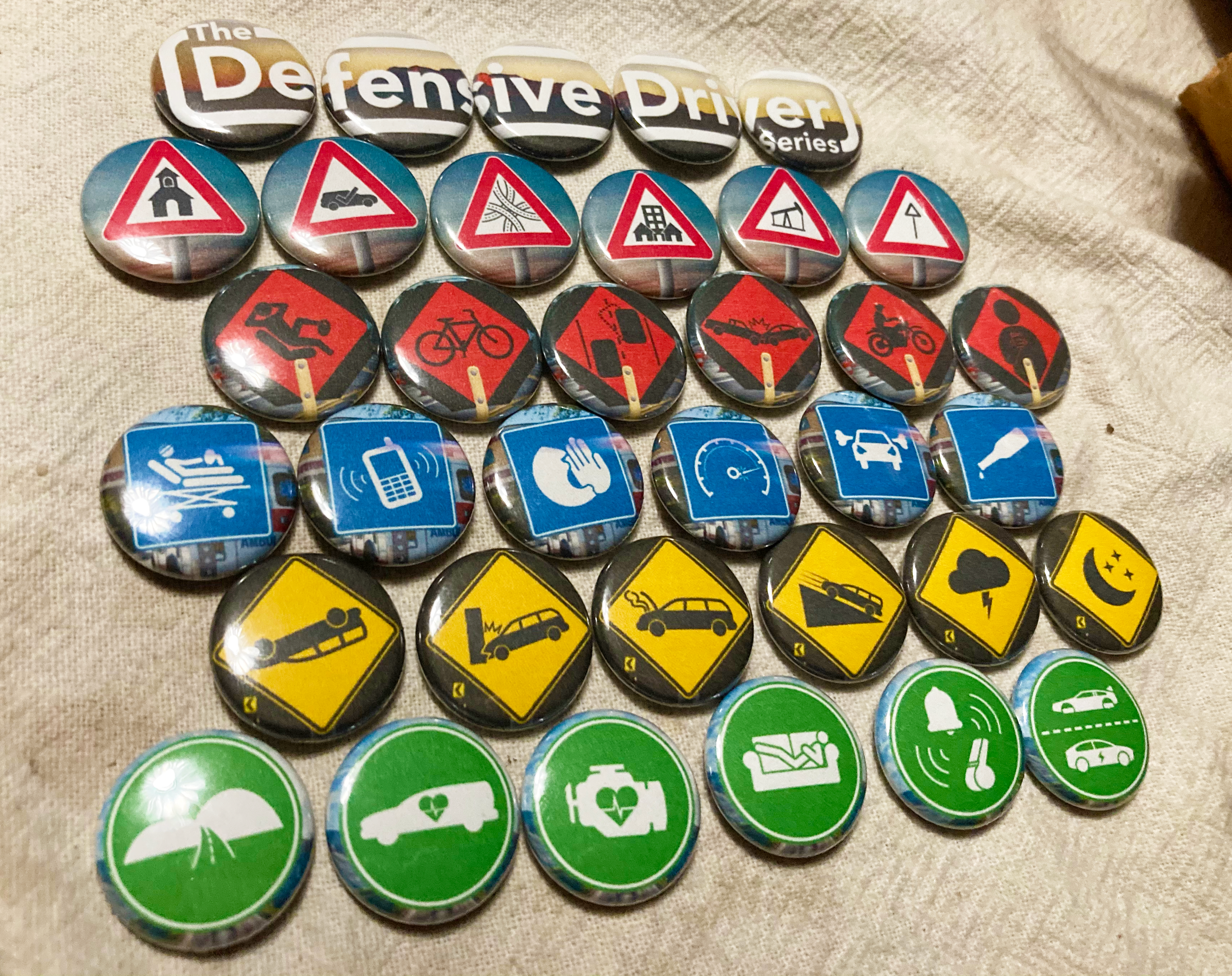
At first, I tried to shape symbols of driving (roads, parking garages and garage doors) into squares, circles and triangles. Eventually, however, I realized that road signs already come in these shapes! For each of the 5 chapters, I found road sign types that related well to each given unit of the course.
Digital Drafts
Round 2
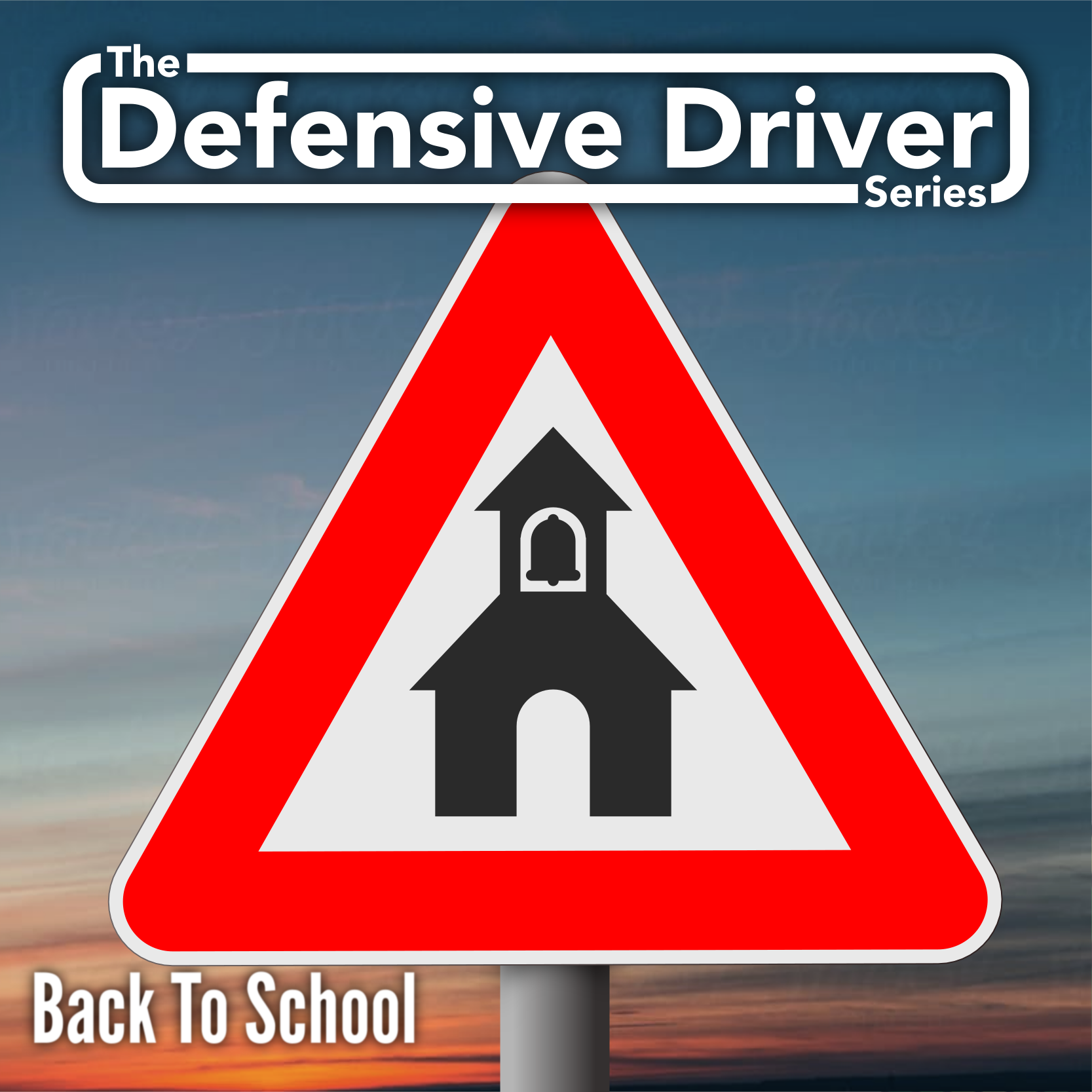
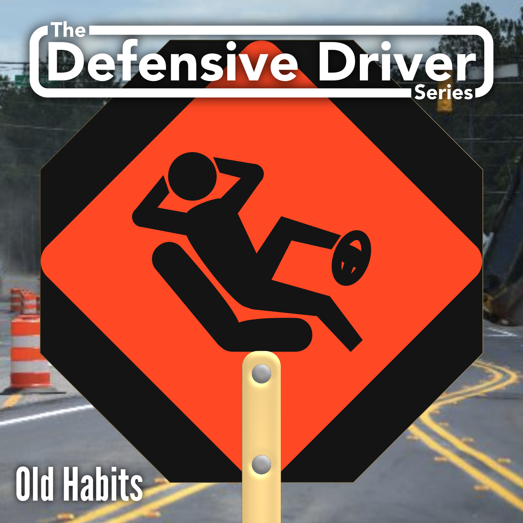
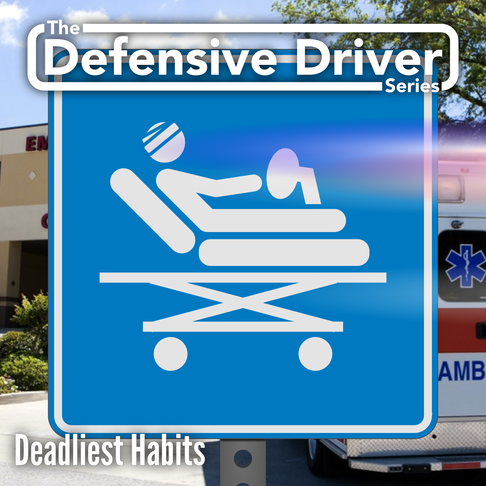
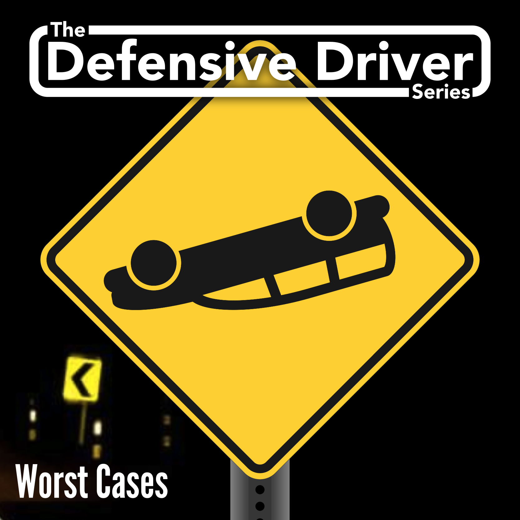
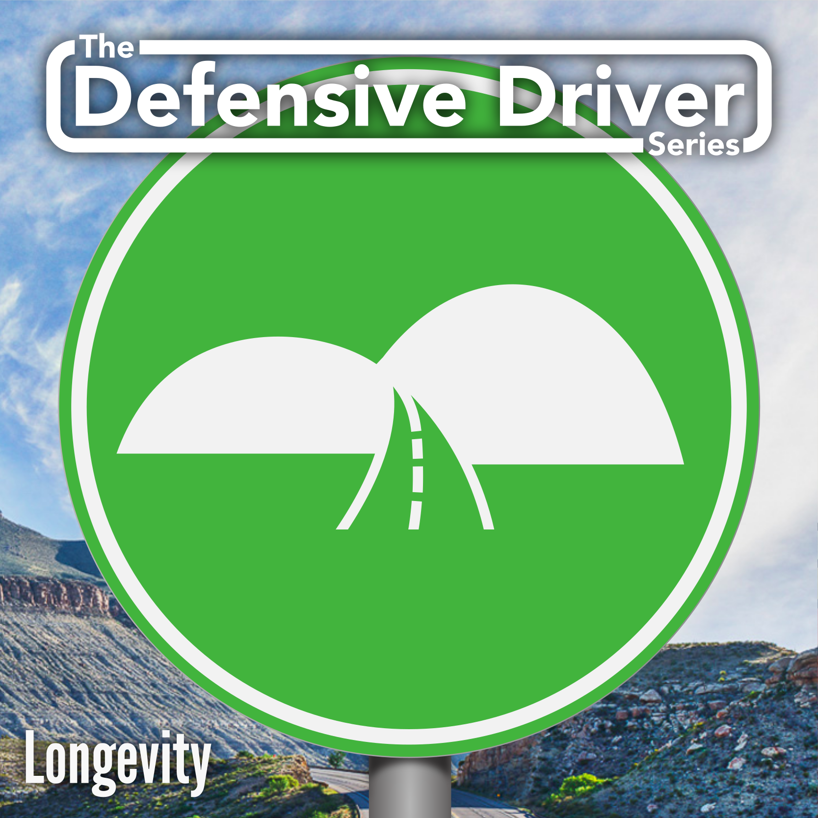
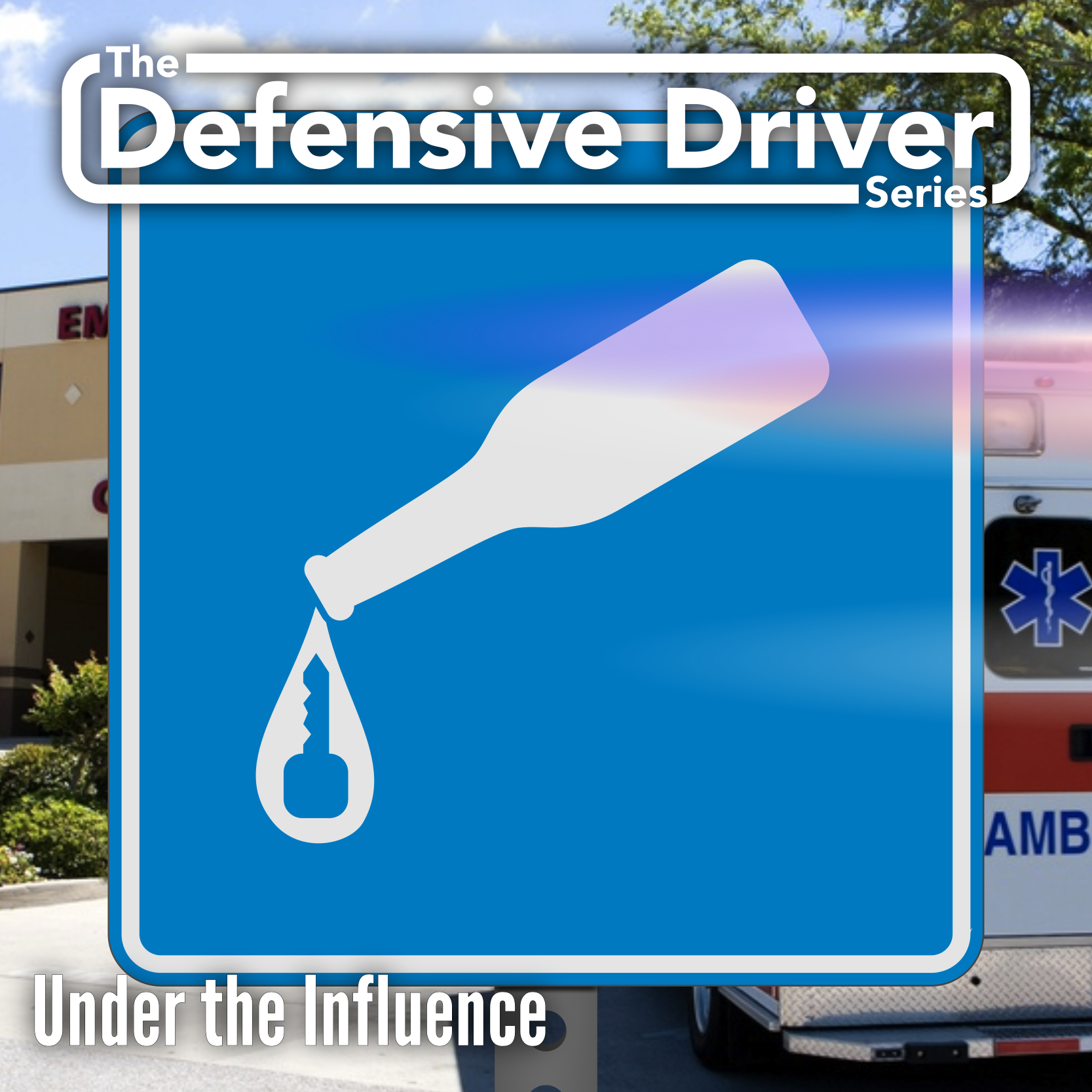
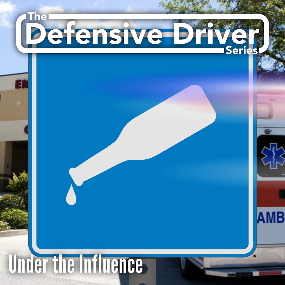
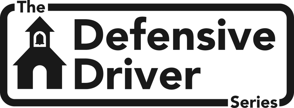
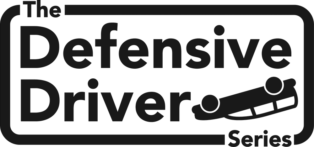
Based on feedback, I took the trailing line off of the signs for still imagery, and decided I would bring it back for motion graphics, but let still imagery be just the shape of the sign. I settled on 5 separate sign shapes, each 5 distinct colors, to represent the 5 chapters of the series. Within each of those chapters, I created iconography for each unit. The unit I had the most trouble representing symbolically Drunk Driving. After making a total of 30 Icons for each unit of the course in this square format, I would eventually free them up to live in other designs where they are not the main focus
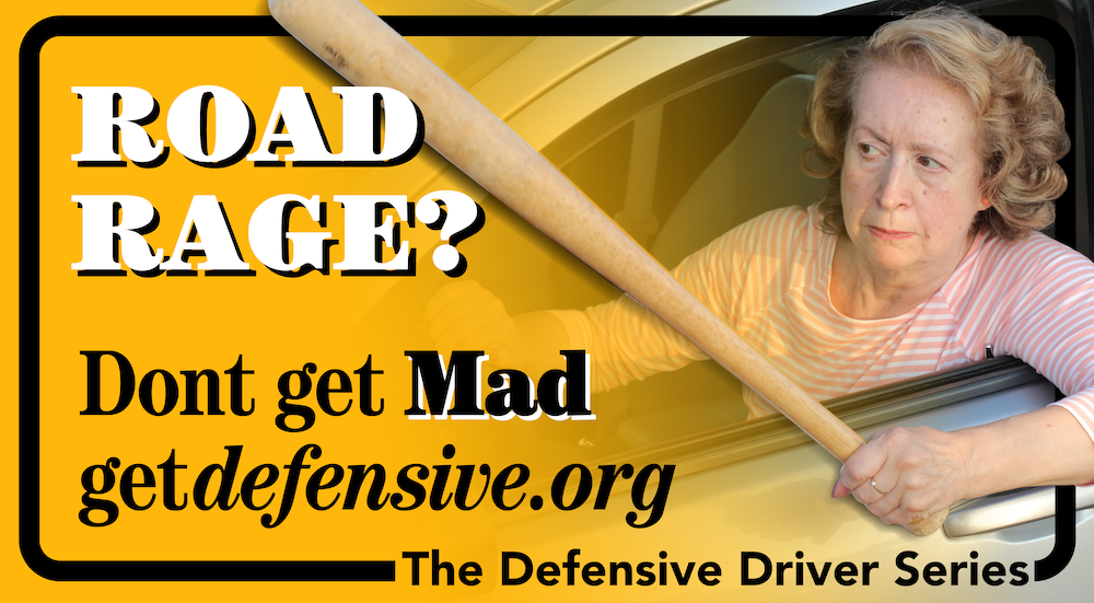
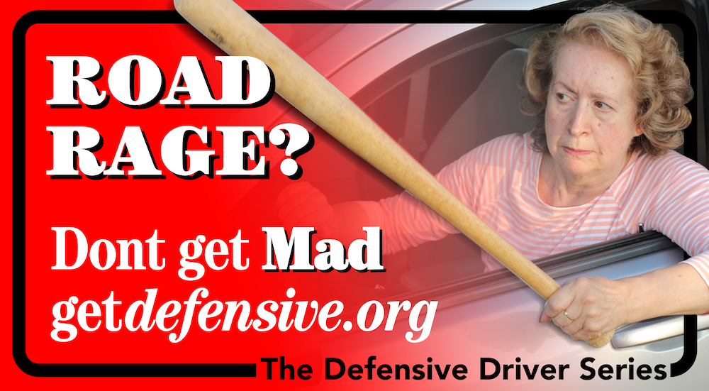
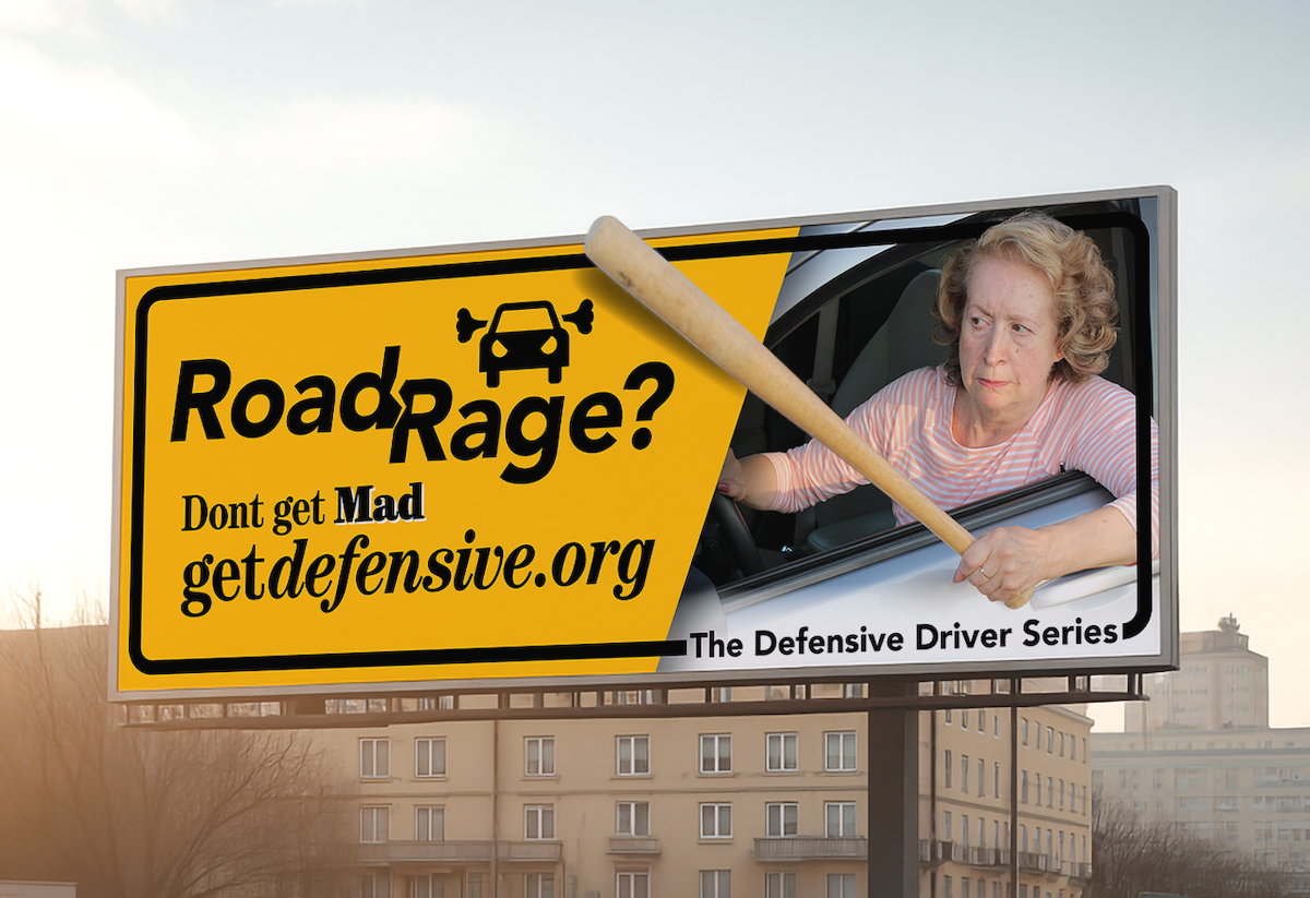
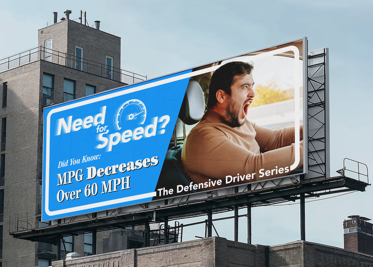
For the billboards, I was having trouble getting a treatment of “Road Rage” that felt appropriate.
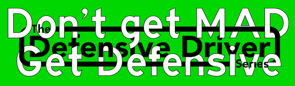
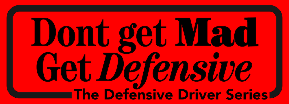
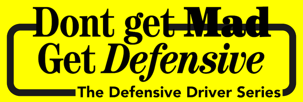
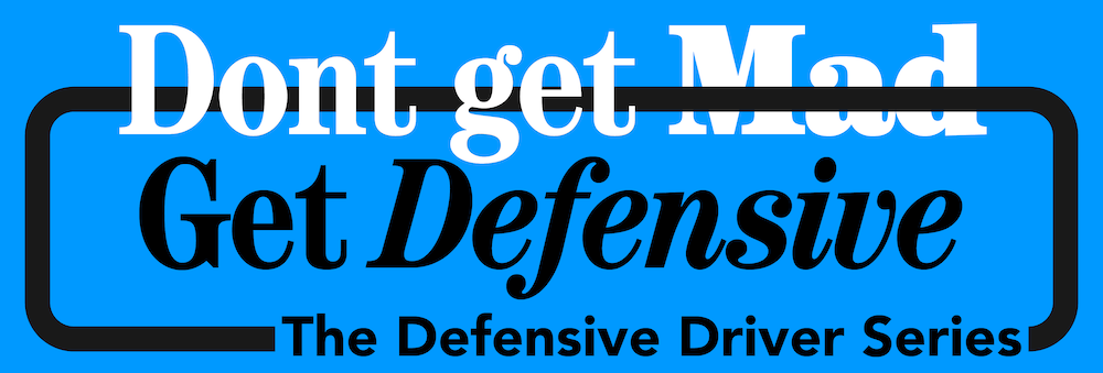
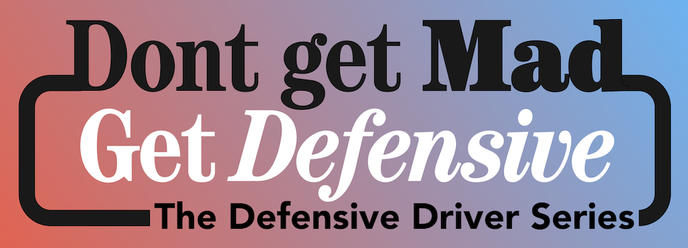
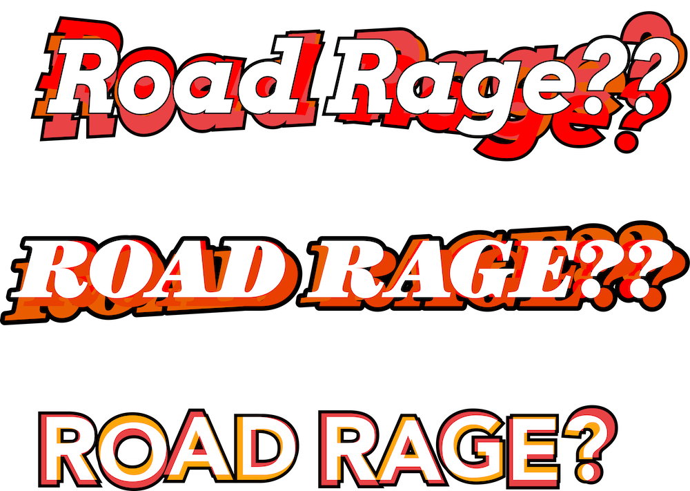
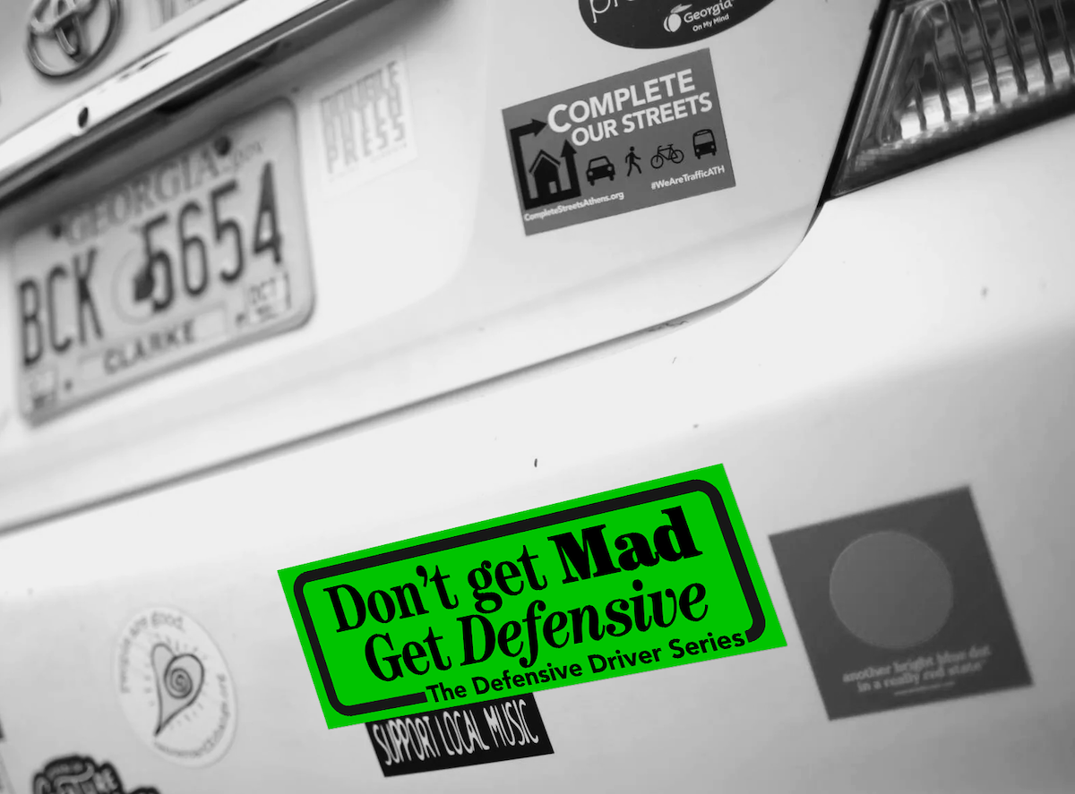
For the bumper stickers, I experimented with subtle tweaks on the treatment of the text.
Finals
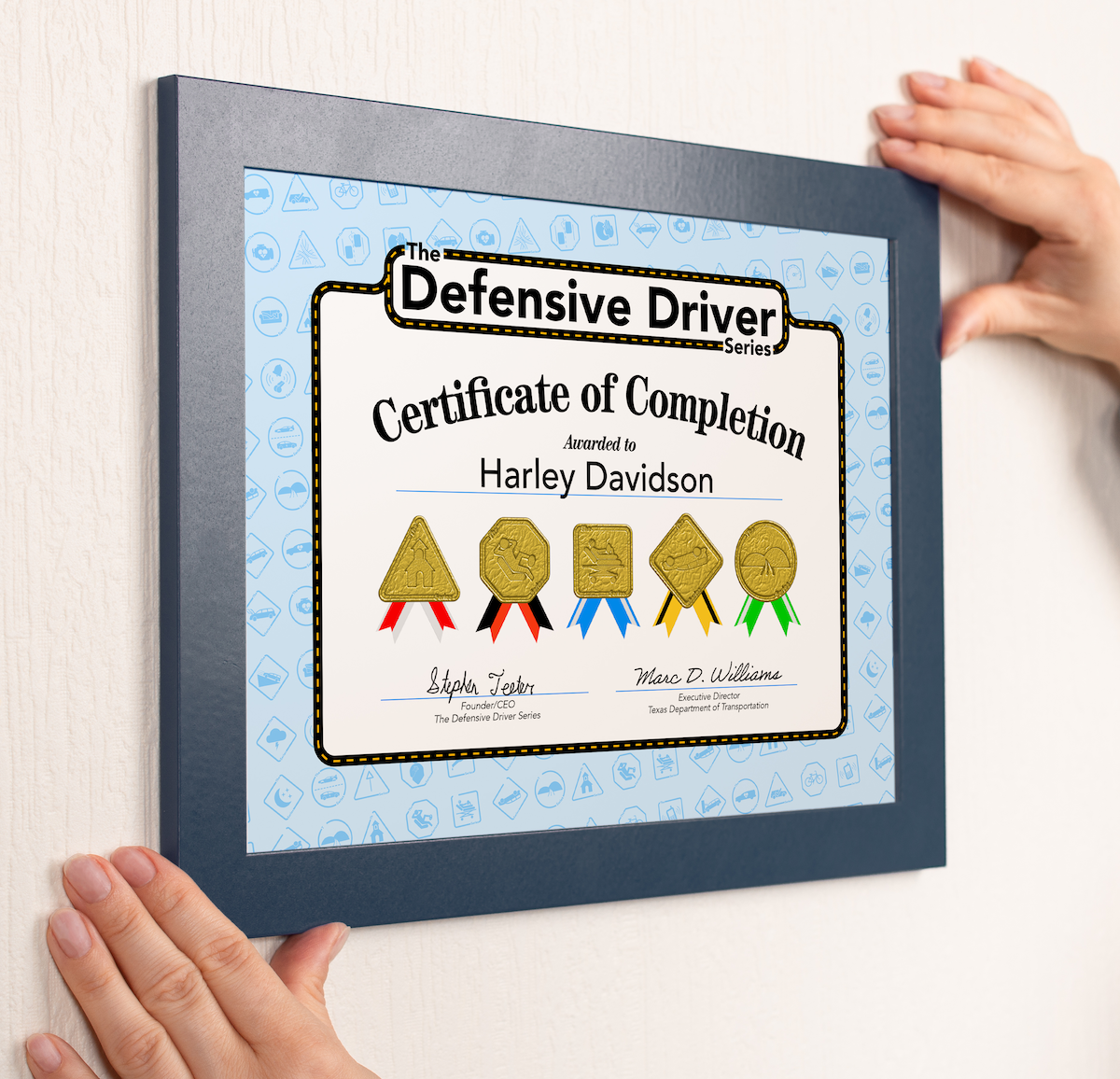
What I want this project to be summed up as, at the end of the day, is: a happy surprise. The course needs to feel like other courses to an extent, so it feels like a legitimate company, but I want every detail, down to the icons for every unit to be so thoughtful, and usually humorous. The billboard ads combine a calm text with an absurd image, to hopefully have some people double taking. The mailers are meant to allude to the tranquil tone the video course will have, and the certificate is meant to punctuate just how important this guide is, we should be proud to be safe drivers.
Reflection
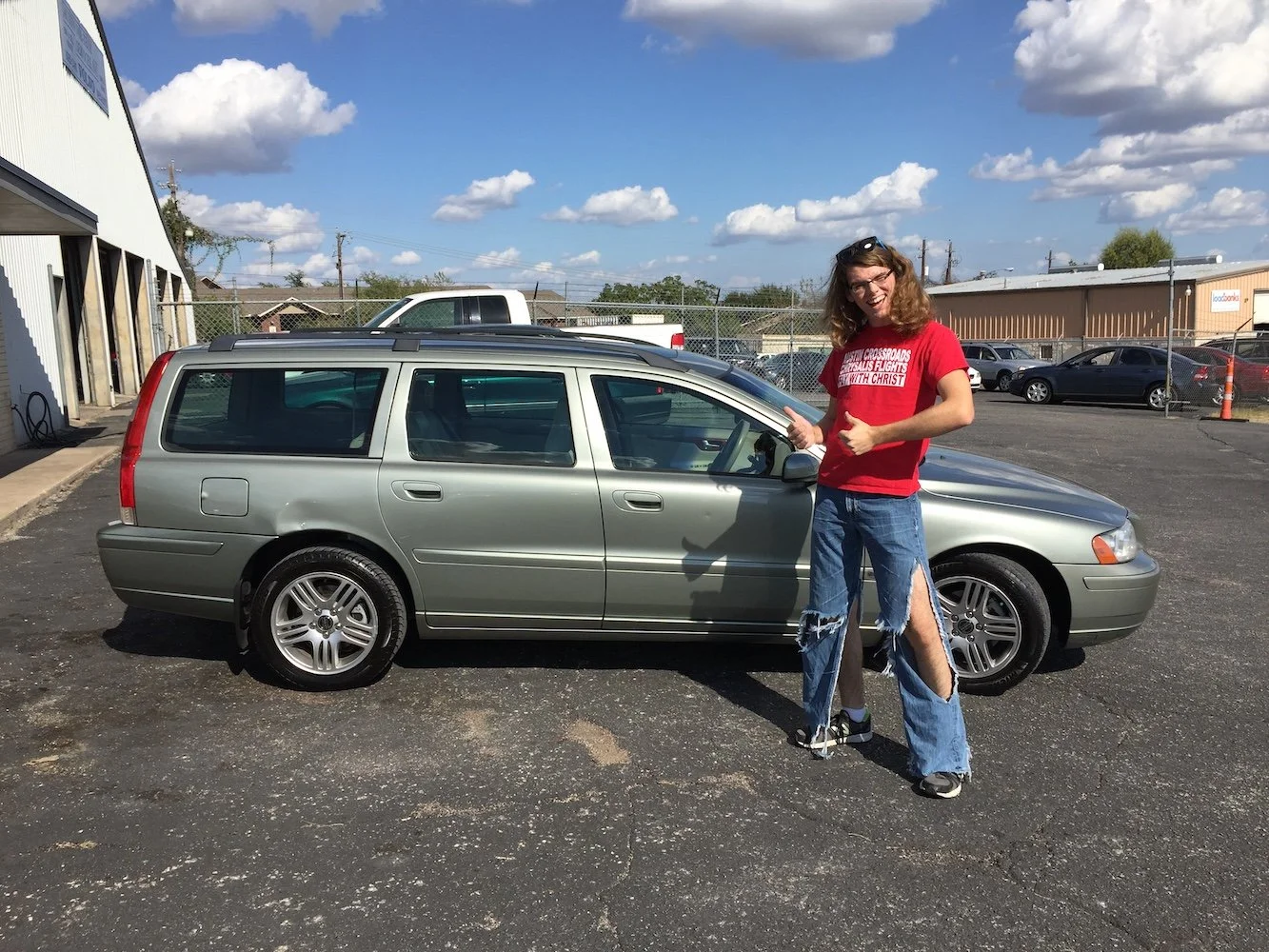
This is the project that got me to go back to school. For some reason, even coming back to it years later, it brings back the earliest excitement I had for graphic design. It has shown me just how much designing for a purpose really fuels my passion. (Pictured: me buying my first car)