

JonnyFest
Event Branding

Concept
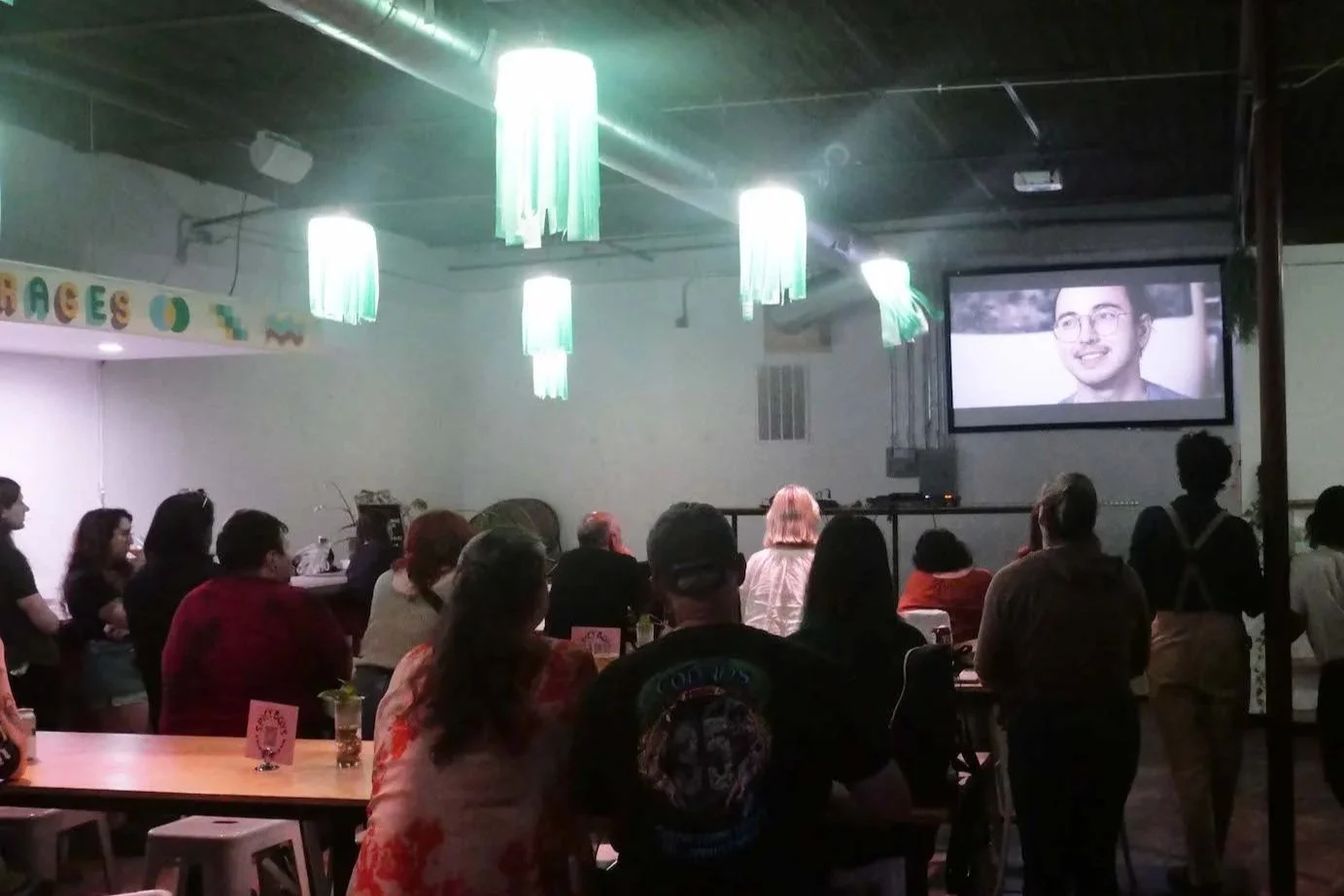
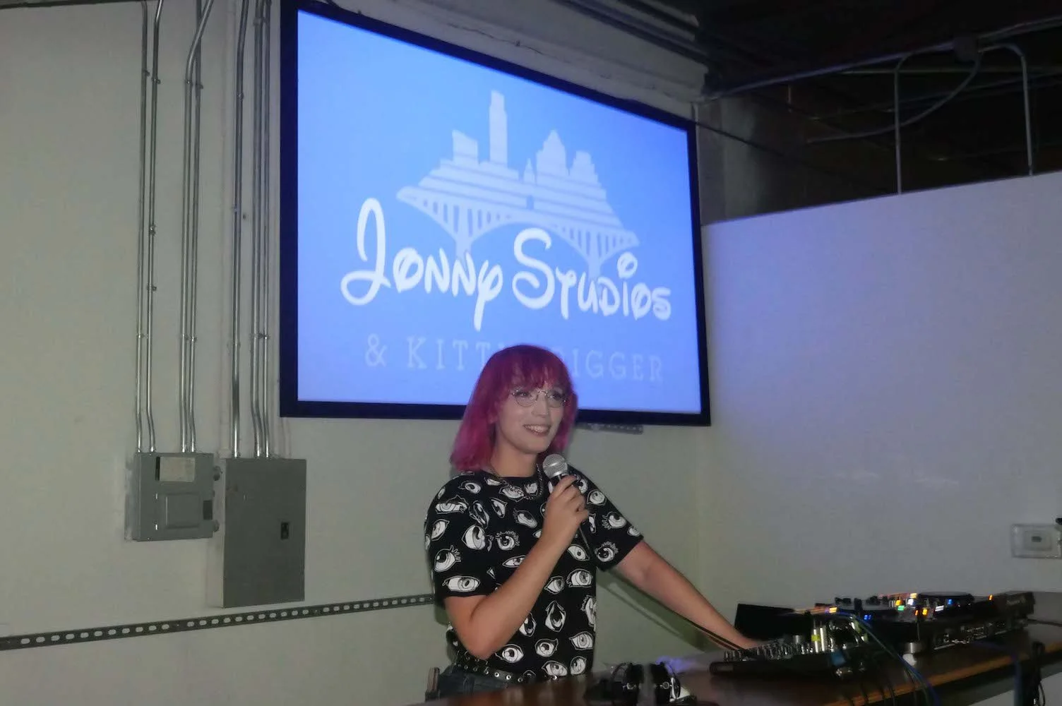
JonnyFest is a (somewhat) annual local short film screening and live music event run by the artist collective, Jonny Studios.
Challenge
To bring in a greater audience of casual viewers, the next iteration of JonnyFest needs to be tailored to the viewer, not just a launching point for artists.
Initial Thoughts
I noticed that most of the people who came to previous iterations of this event were there to support the filmmakers, but were happily surprised when there were other activities like making buttons and live music. For the next JonnyFest, I was inspired by free events like Blues on the Green to try and make sure this outlet for local artists is actually a good time for all involved, even if it is just the parents of the artists showing up.

Inspiration

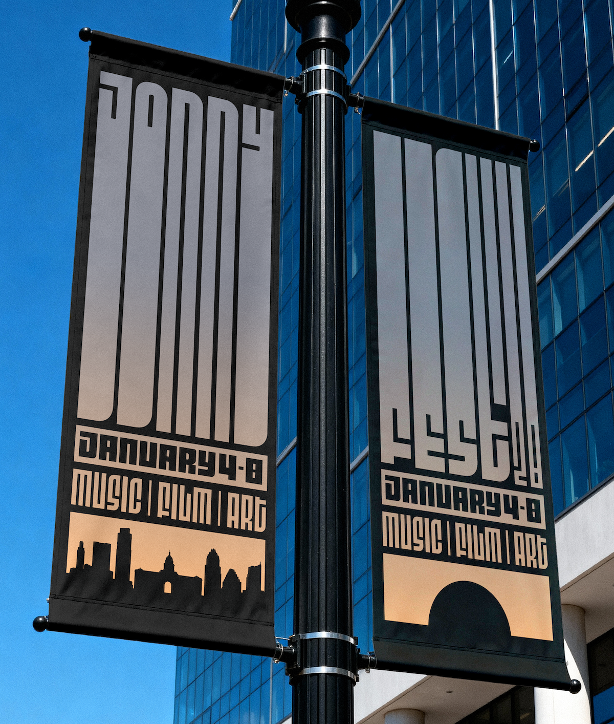
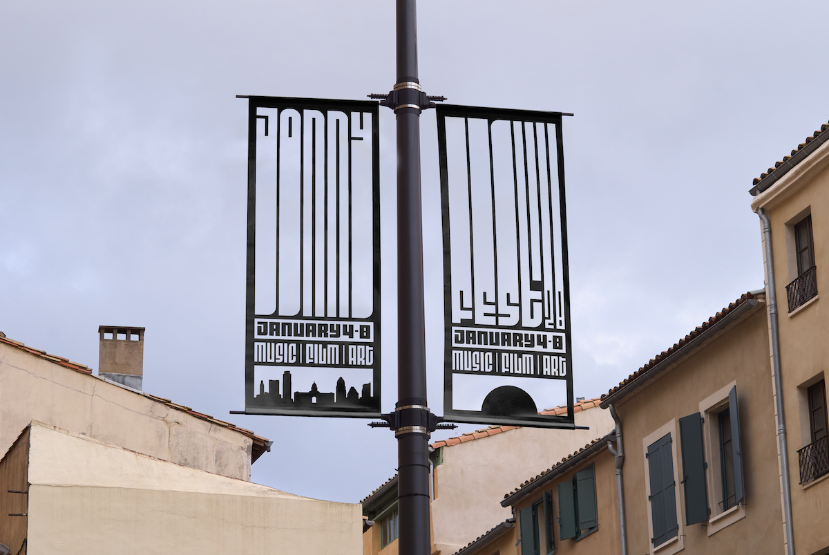
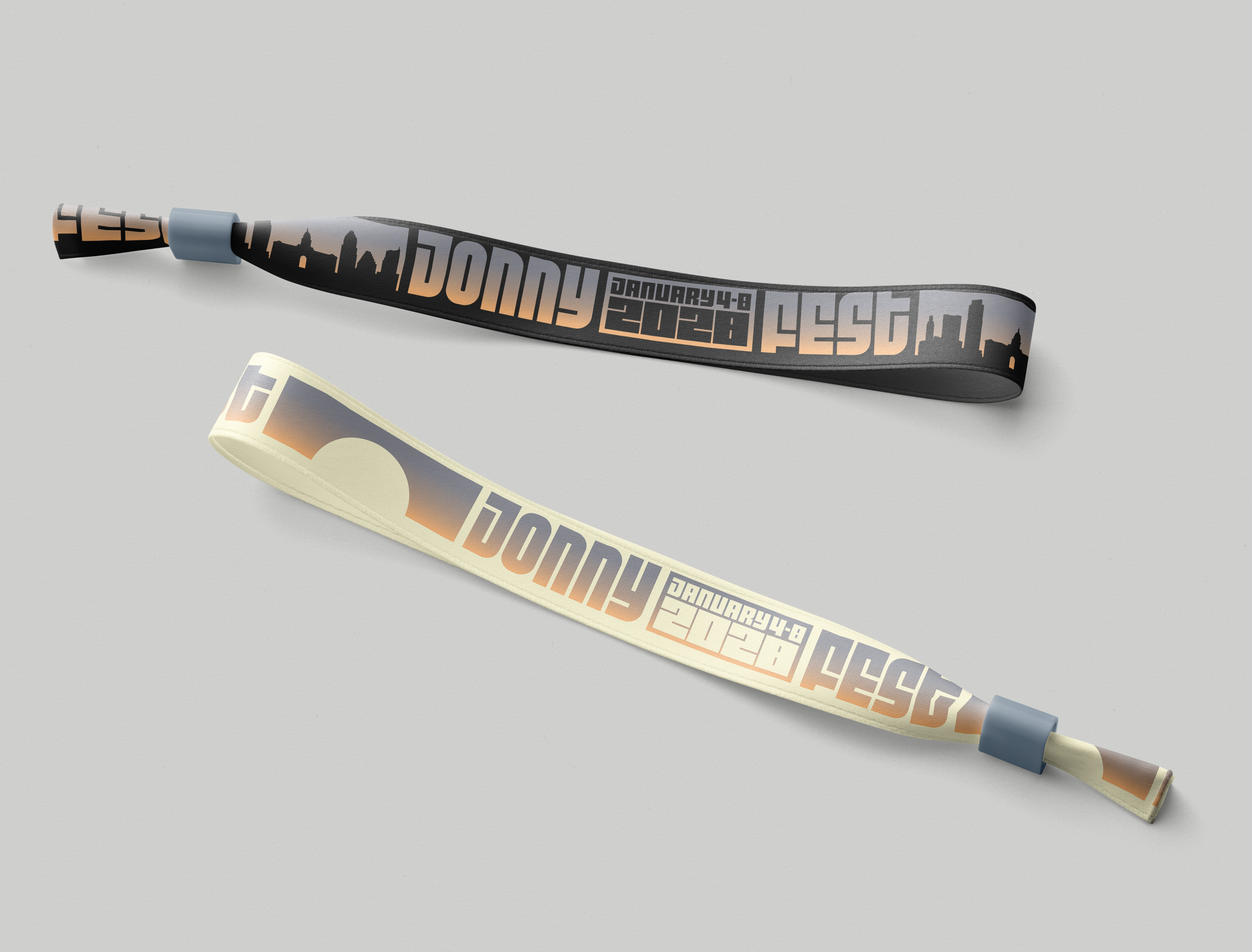
The BauHaus use of shape combined with the unreproducible gradient of a sunset were the biggest inspirations for this project. For this design, I was inspired by the unreplicatible experience of sunsets. Photos, paintings, or footage of sunsets never do them justice. And just like the sunset, art has to be experienced directly to be fully realized. Humanity can’t be represented by anything other than a human (I’m looking at you, AI).
Sketches

"AI Jonny" by Jeremy Cripe (@oobliesque)

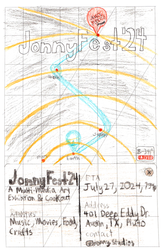
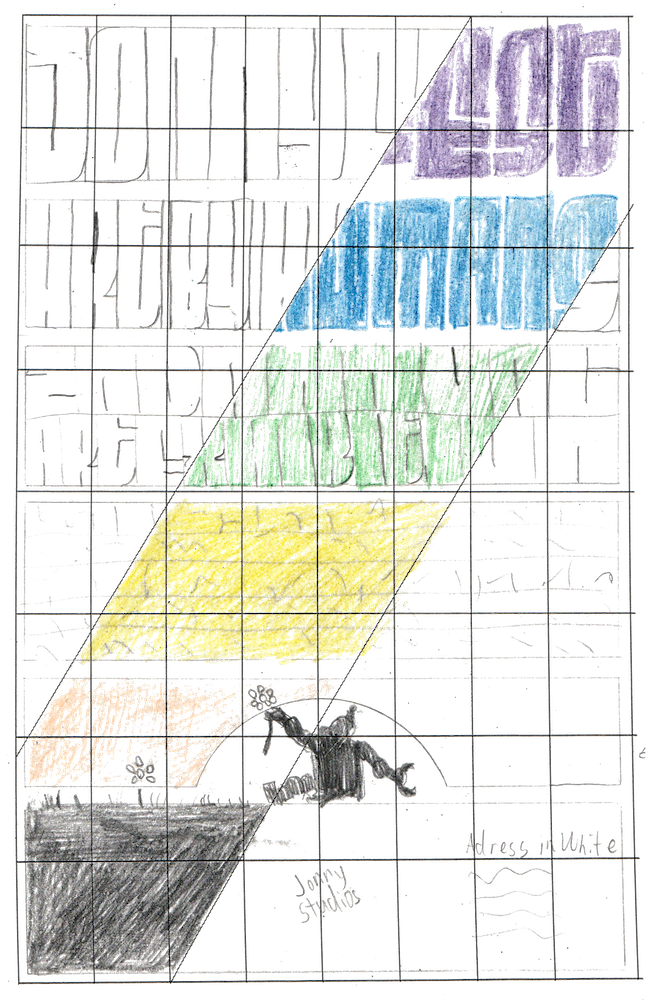
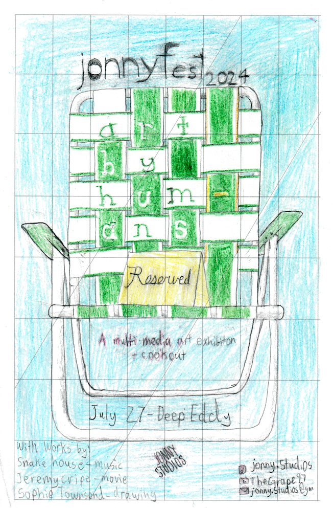
For the initial poster design, I iterated through many concepts: a smart phone map routing you to the far edge of the solar system (because the event is out of this world!), blocks of text that gradate into a setting sun, robots living off the land, and fancy reserved placards on fold-up lawn chairs.
Digital Drafts
Round 1

![JonnyFest24 [Recovered] all-03.png](https://images.squarespace-cdn.com/content/v1/69b0cb935dfe9c345aab2792/6a23234b-6e43-42bb-b20f-22f78ea44e3c/JonnyFest24+%5BRecovered%5D+all-03.png)
![asdf [Recovered]-01.png](https://images.squarespace-cdn.com/content/v1/69b0cb935dfe9c345aab2792/bb5c1d06-a4b8-4513-a3fc-0bb5cdc7b94a/asdf+%5BRecovered%5D-01.png)
![asdf [Recovered]-04.png](https://images.squarespace-cdn.com/content/v1/69b0cb935dfe9c345aab2792/f2a4ce5e-a4e8-4384-983d-6ae00712bf2e/asdf+%5BRecovered%5D-04.png)
I drafted up versions of the sunset and lawn chair designs. With the sunset, I experimented with both solid blocks of color and gradients flowing through the whole design.

Digital Drafts
Round 2
![JonnyFest24 [Recovered] all-12.png](https://images.squarespace-cdn.com/content/v1/69b0cb935dfe9c345aab2792/8cc38a41-67fa-4d1c-8e7e-c05d2221f1e5/JonnyFest24+%5BRecovered%5D+all-12.png)
![Thin e [Recovered].png](https://images.squarespace-cdn.com/content/v1/69b0cb935dfe9c345aab2792/b609e342-3719-4bdf-9f14-15391c4392b1/Thin+e+%5BRecovered%5D.png)
![JonnyFest24 [Recovered] all-16.png](https://images.squarespace-cdn.com/content/v1/69b0cb935dfe9c345aab2792/f7a2d4bf-9a50-4bcf-a8c7-a0d3a4e28c0b/JonnyFest24+%5BRecovered%5D+all-16.png)
![JonnyFest24 [Recovered] all-18.png](https://images.squarespace-cdn.com/content/v1/69b0cb935dfe9c345aab2792/d8866d03-6bdb-42b5-9577-094645130d7e/JonnyFest24+%5BRecovered%5D+all-18.png)
I pulled the sunset gradient into the lawn chair design, and I landed on using the gradient for the sunset design as well.
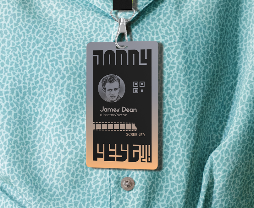
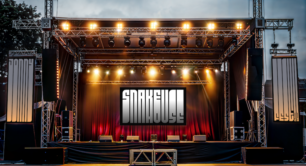
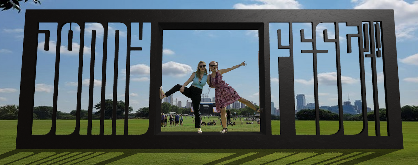
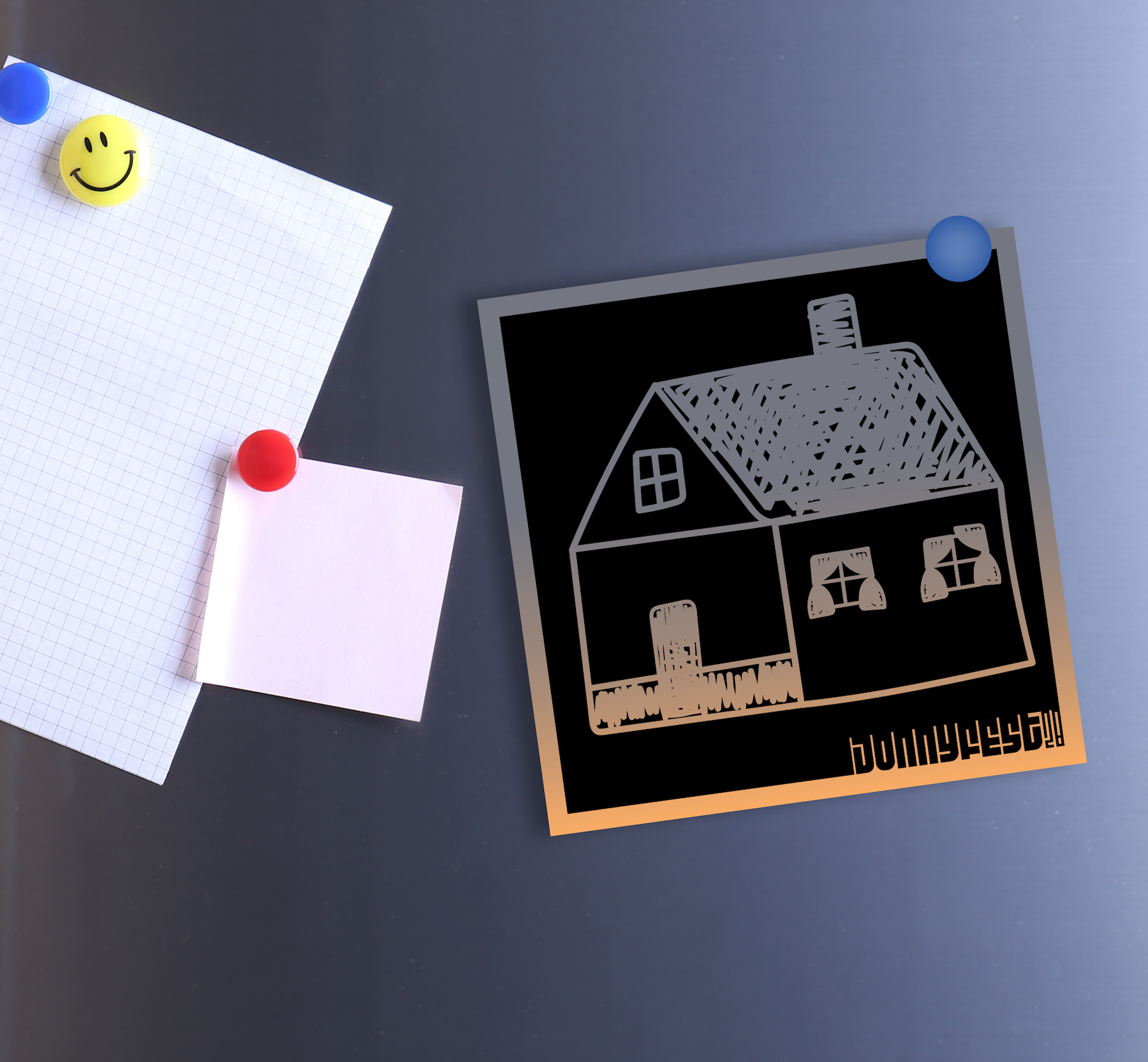
Finals
The most common feedback I was getting on the sunset designs was that they were hard to read. I had to modify the typeface quite a bit to get everything readable: expanding the space between the letters and adding curves in the “n”s of Jonny. The typeface I used, Fit Pro, had to be modified a lot to fit this application, but I did not want to compromise the idea of the stretched text. Where possible, I wanted the real color of the sky and sunset to shine through the design, rather than try to reproduce it in print.
Reflection
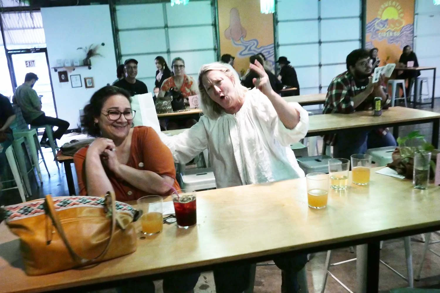
This design got me close to giving up multiple times. It was an idea that was inherently gonna be hard to read, but I had so much positive feedback on it, and people genuinely excited to see it come together, that it pushed me to make it as legible as possible. Honestly, it’s still kind of hard to read, but limiting myself to only stretching “JonnyFest” helped the overall poster. I hope one day we are able to put this festival on! (@itskittytrigger pictured)