

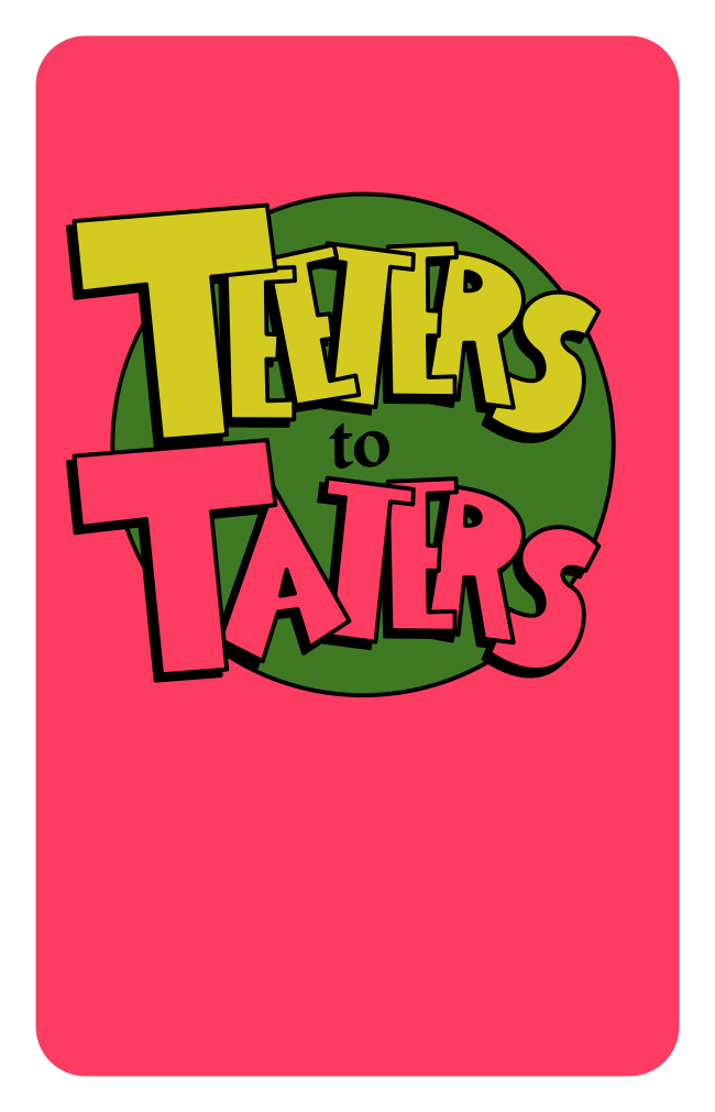
Teeters to Taters &
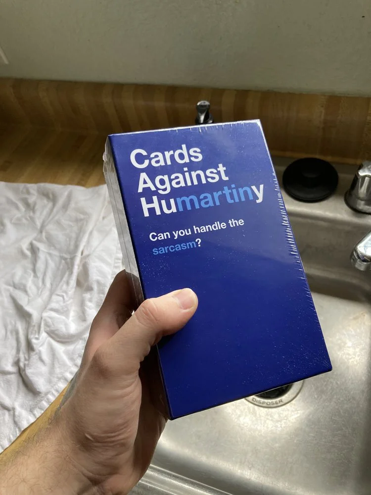
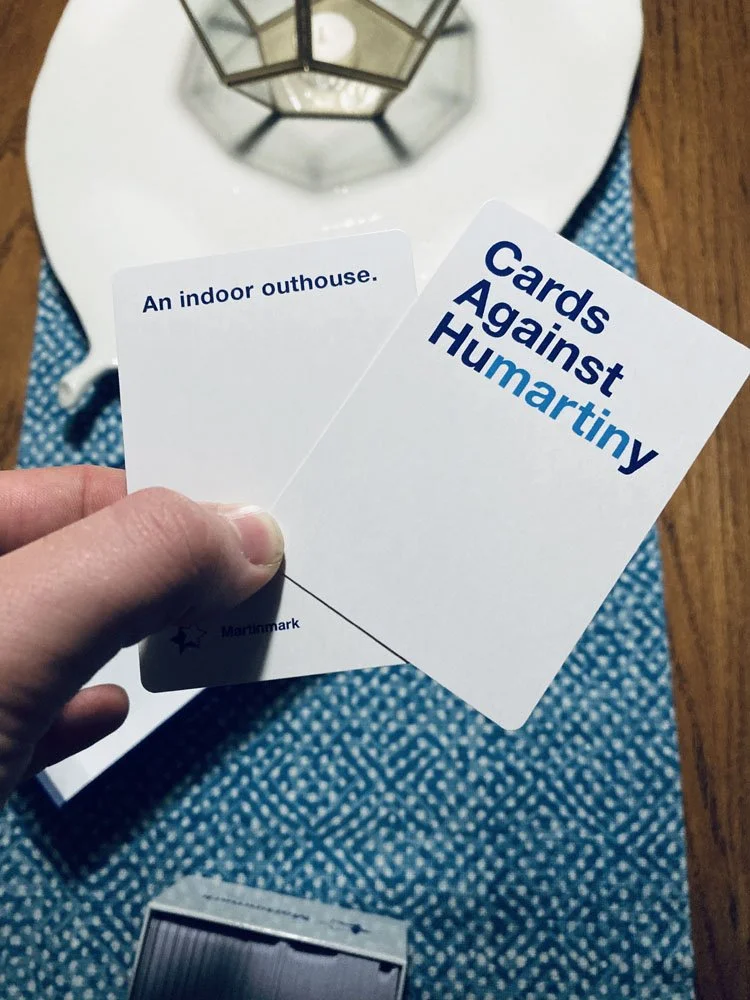
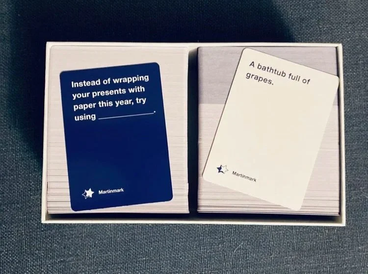
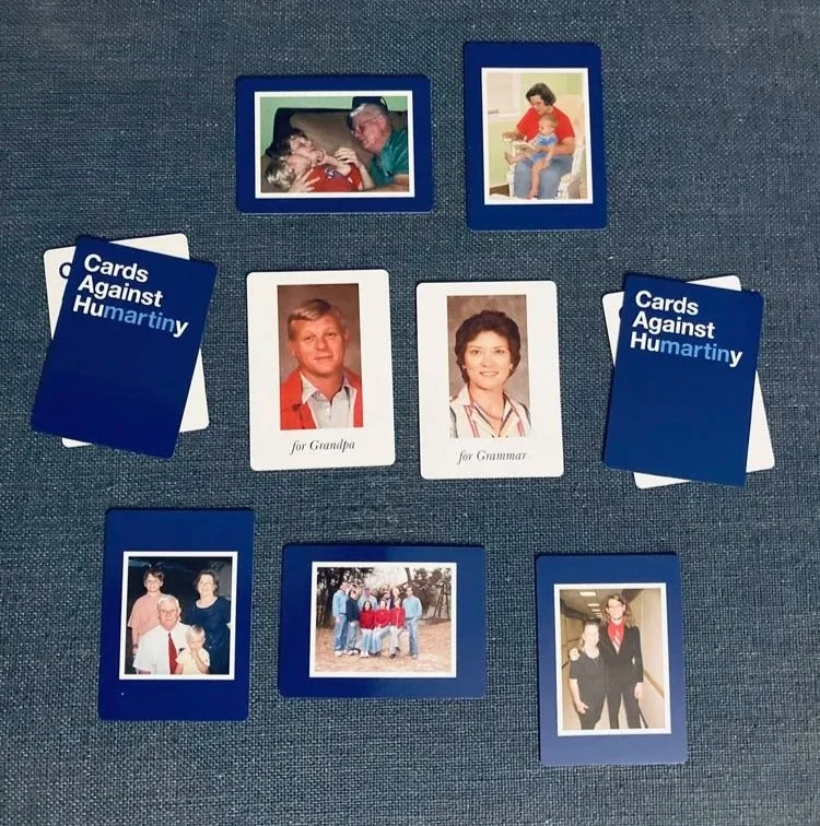
Cards Against Humartiny
Family Card Games

Concept
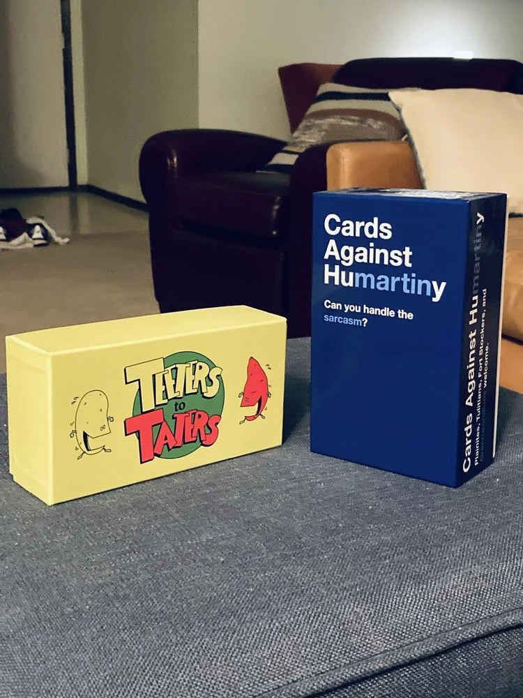
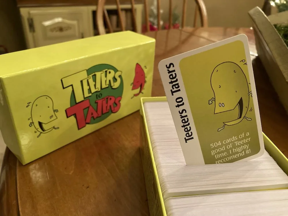
Two separate card games created to play with either sides of my family. “Teeters to Taters” for my dad’s side, a kind speaking, small-town group of multigenerational farmers. “Cards Against Humartiny is for my mom’s side, the playfully teasing, often sarcastic group of hilarious misfits.
Challenge
To design and print two card games that can separately match the temperaments of the two sides of my family.

Inspiration

Creating a parody deck of Apples to Apples started with evolving the apple characters into potatoes, one of the biggest staples of the Teeter family.
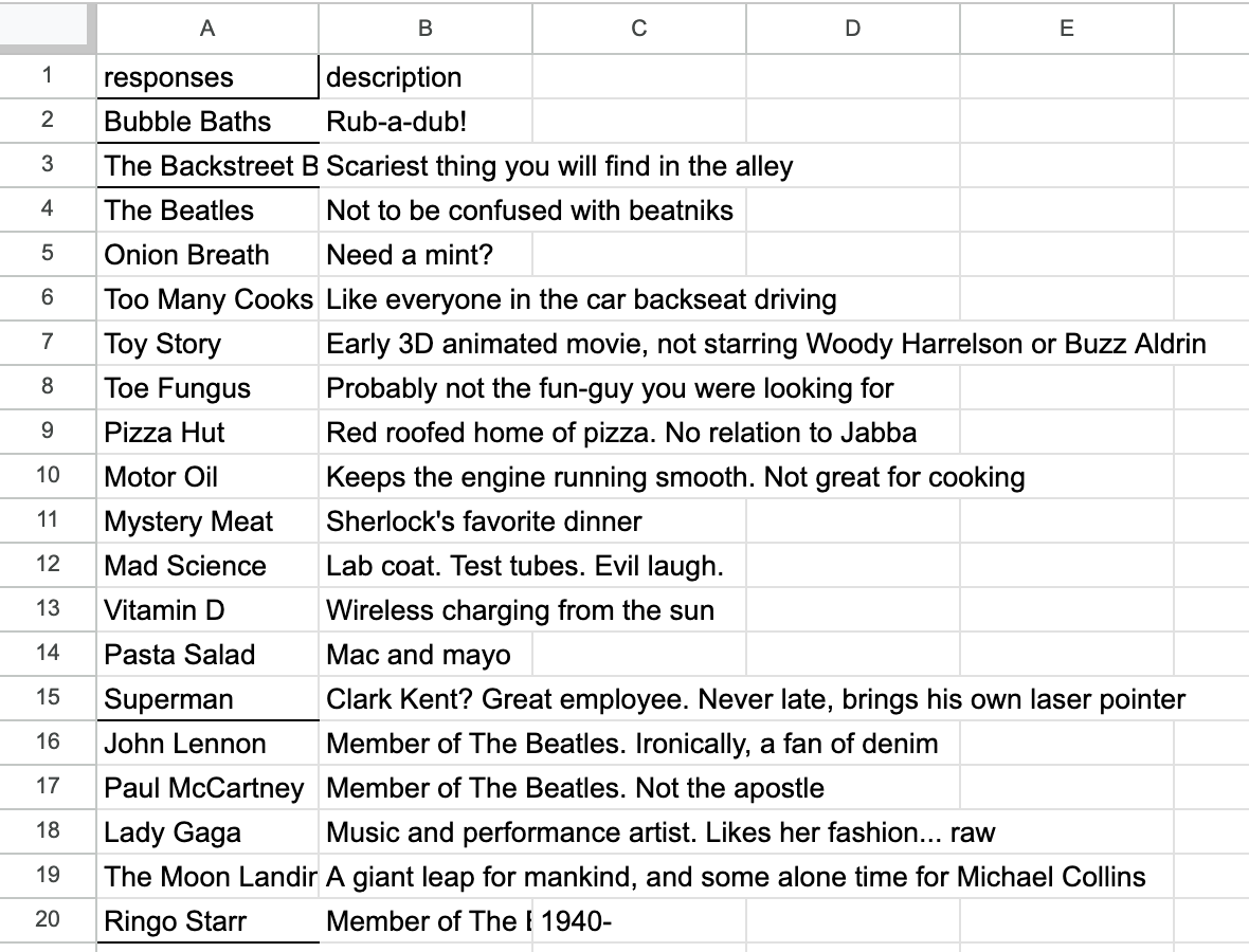
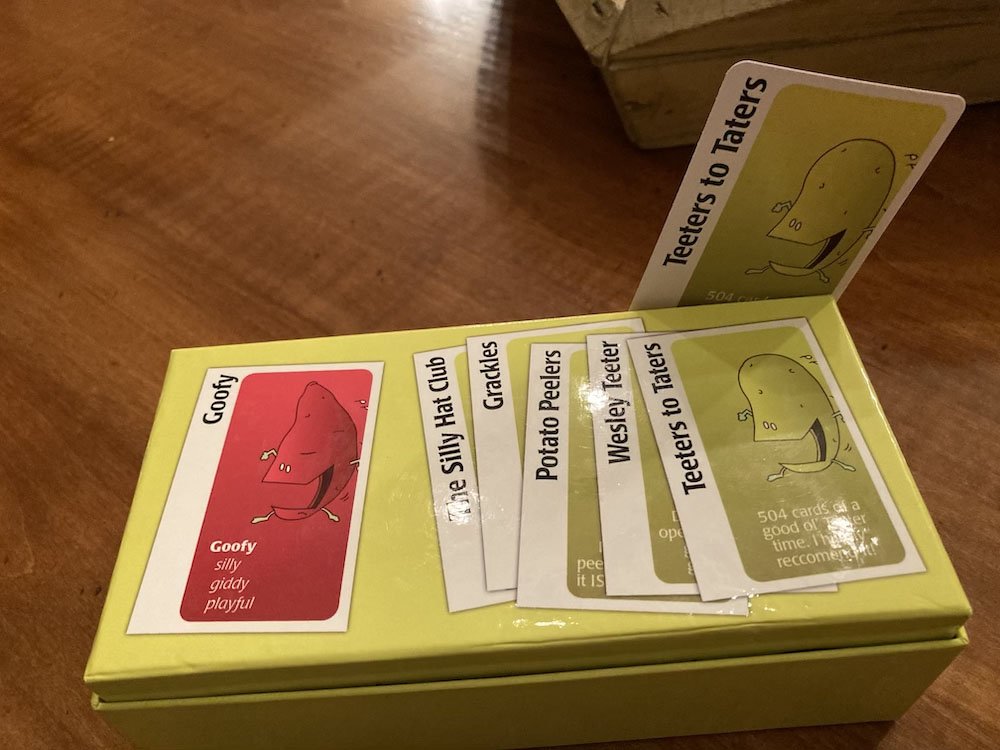
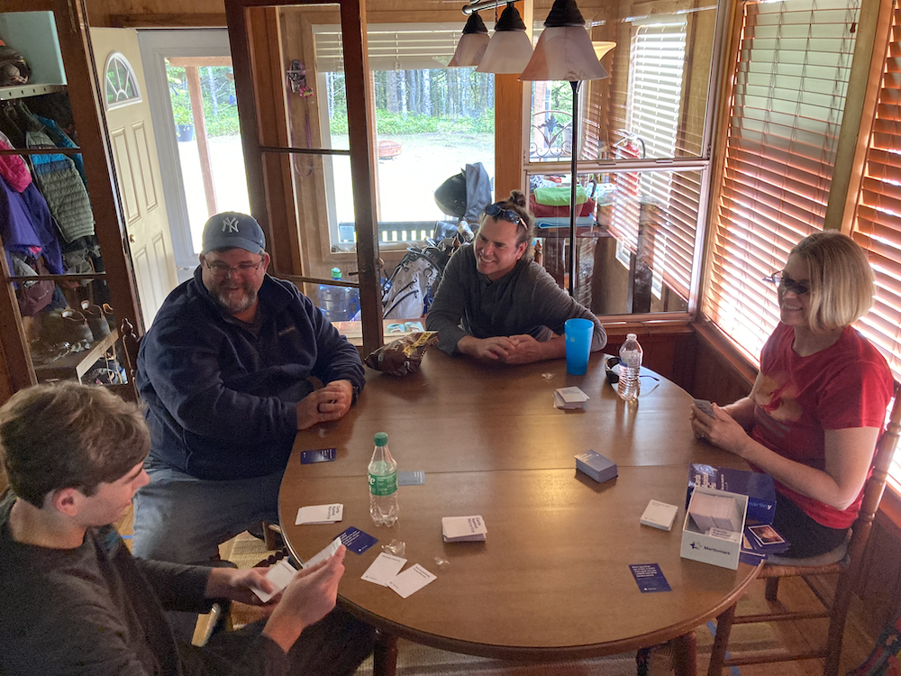
These completely-original, custom-written decks of cards came from months of me and my friends, during covid, playing an online version of Cards Against Humanity that allowed us to, over time, build a list over 500 cards! Me and my parents later came back and added inside family jokes to their respective decks.
Digital Drafts

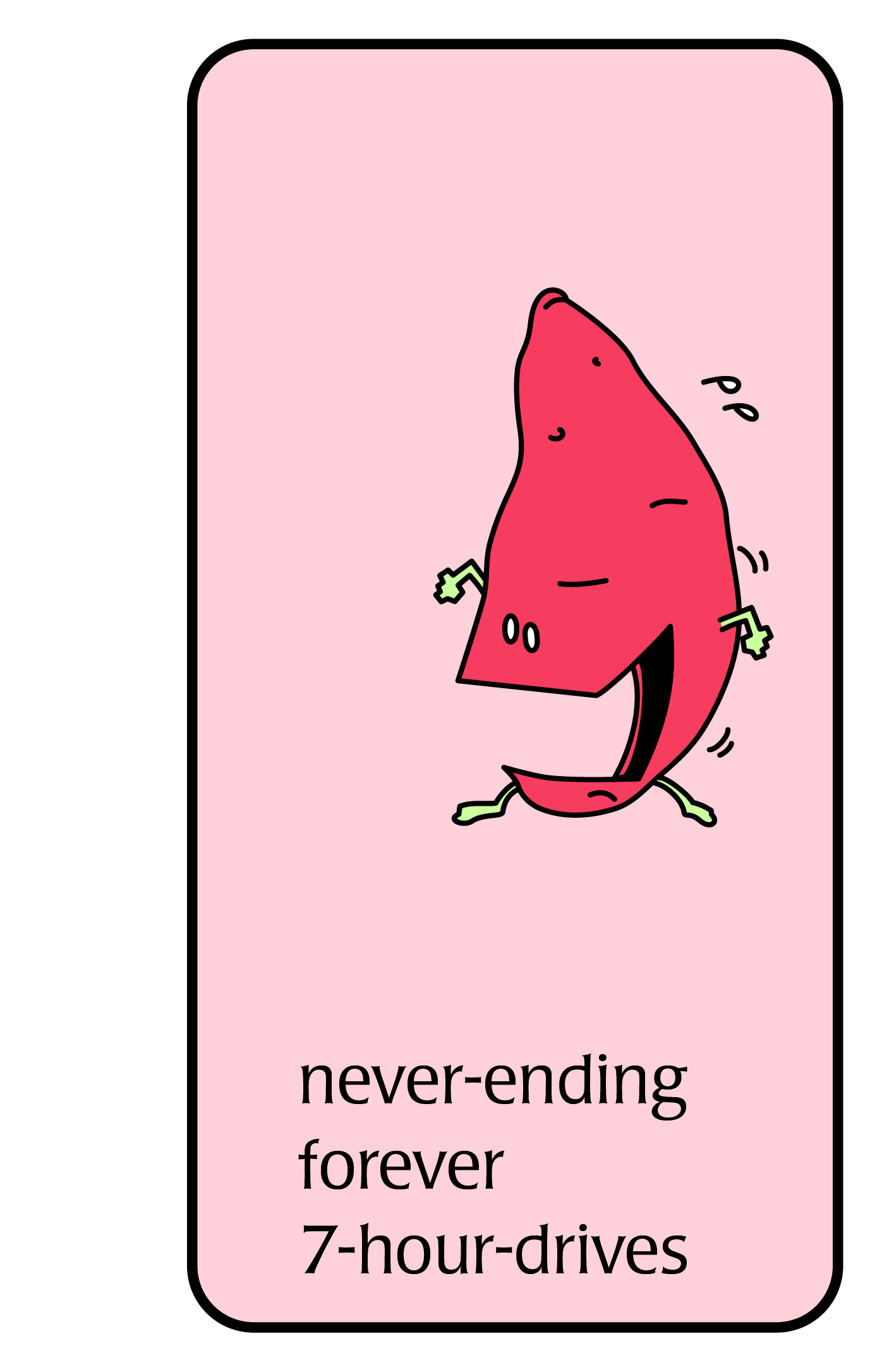
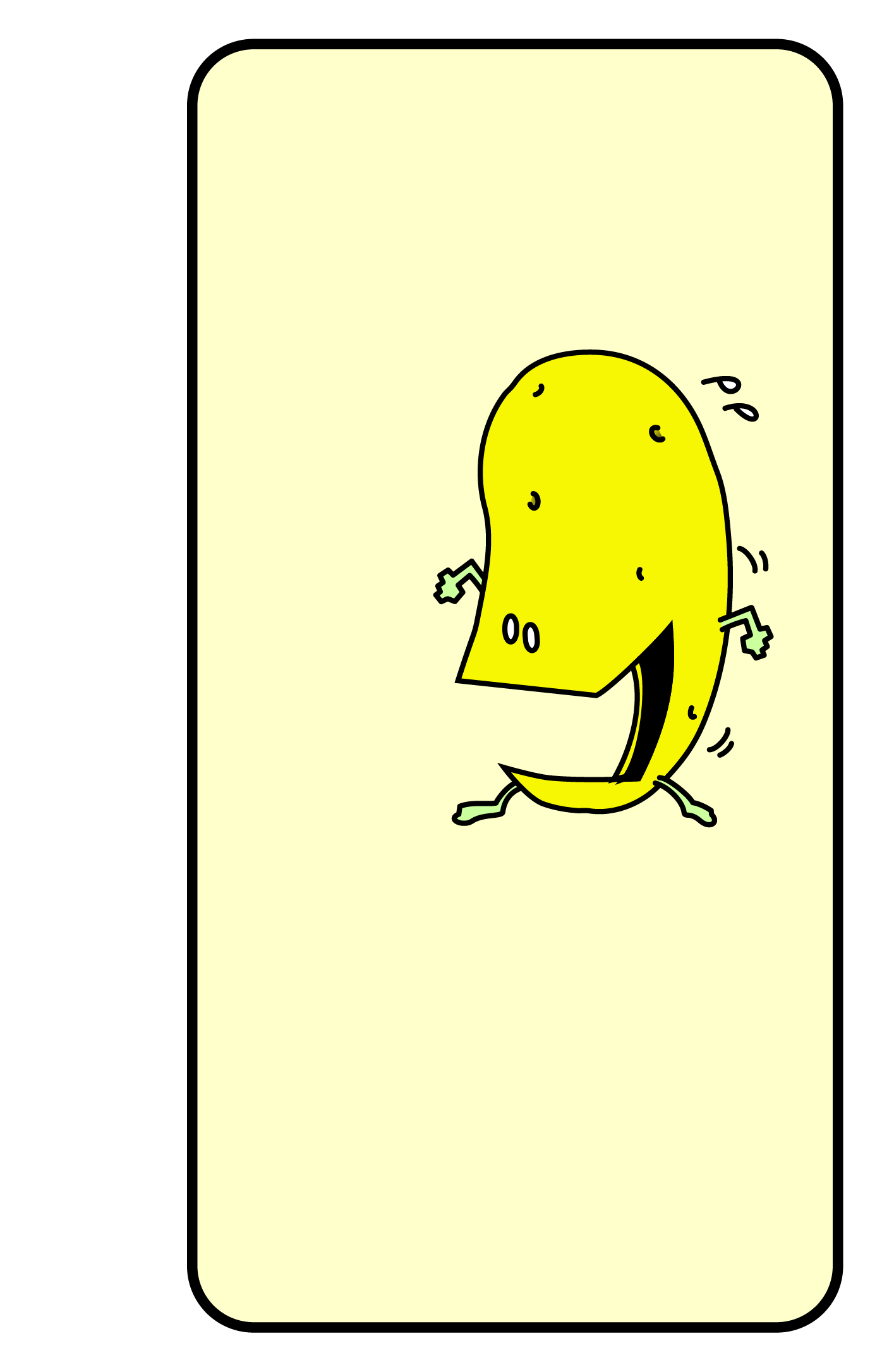
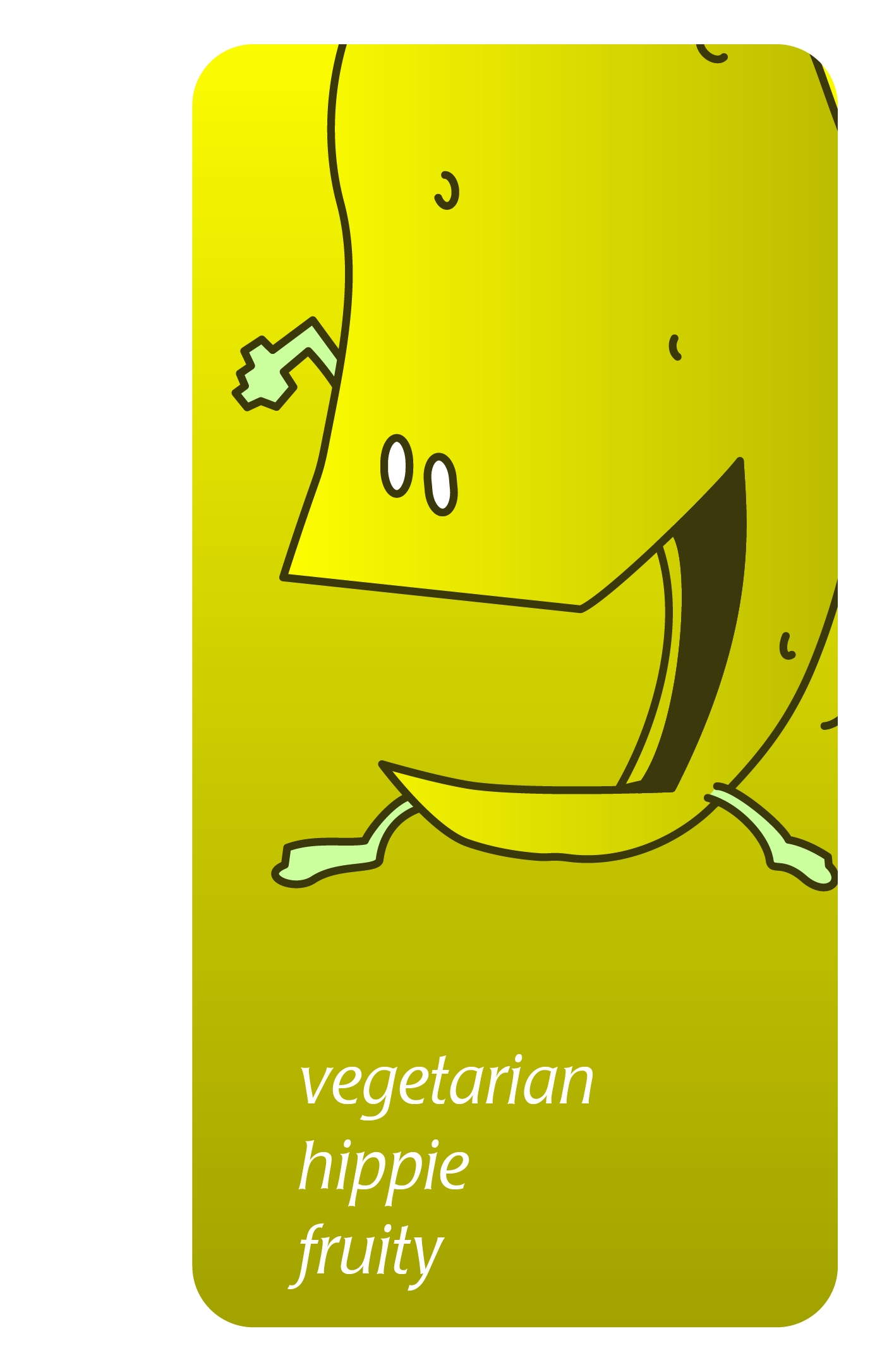
After defining some new colors that better fit potatoes rather than apples, I looked through the full history of the Apples to Apples franchise, and realized they had two distinct eras. The first era had a flatter simpler design, and the second had more depth, achieved by adding gradients. Trying to reuse as many of the letters as possible from the original apples to apples logo, Ts and Rs were the only characters I had to create from scratch. Creating a card with all the instructions proved to be not nearly enough space…

Production
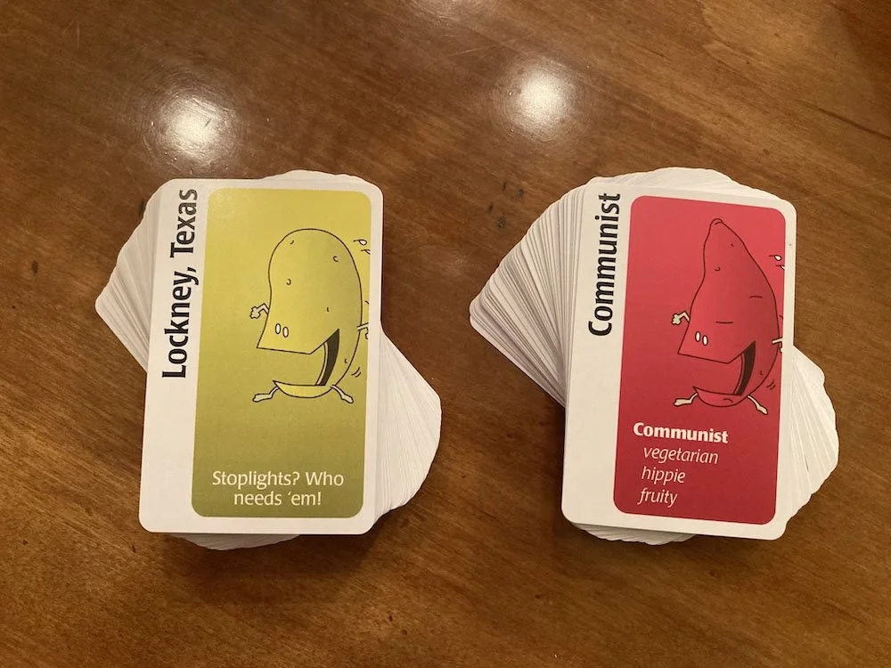
+
=
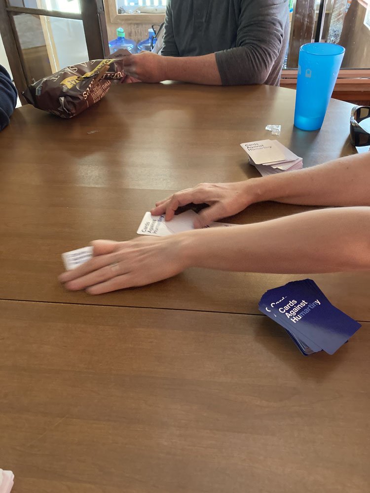
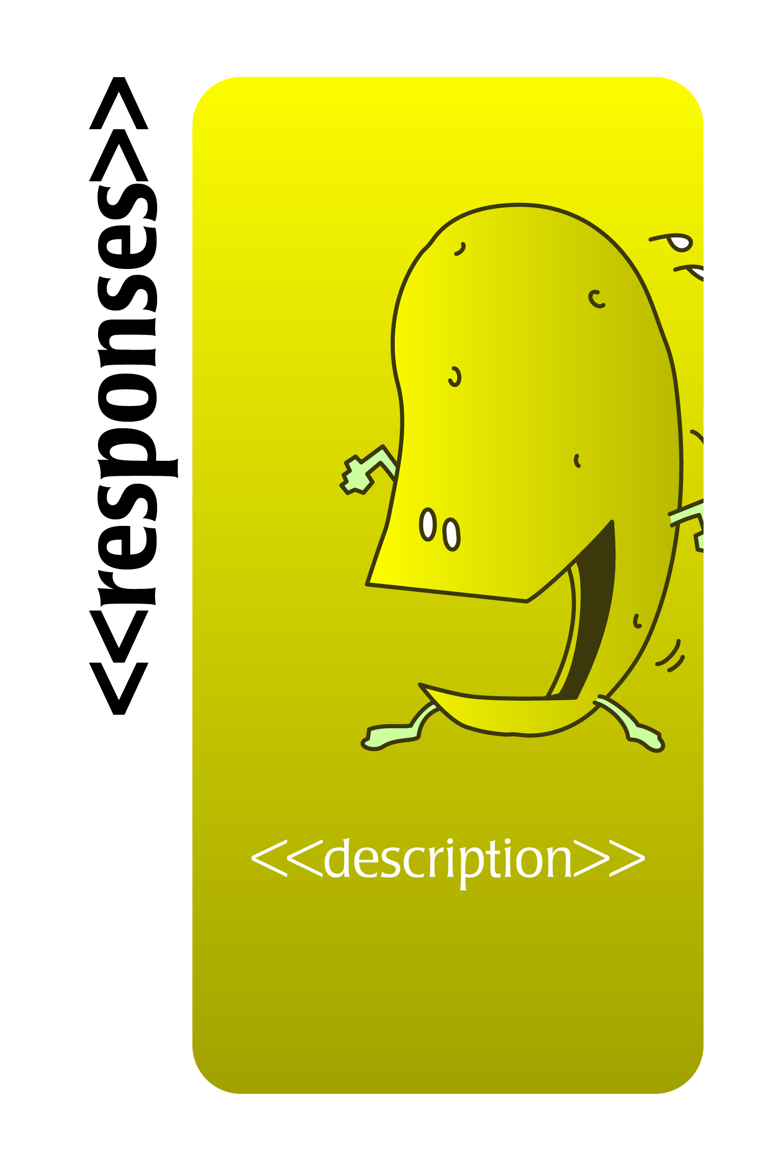
To format over 500 individual cards for Teeters to Taters and over 600 for Cards Against Humartiny, I discovered the wonders of Data Merge on Indesign. I was able to set up a template for just one card and import a spreadsheet containing all my card data, and the program automatically formatted the entire deck for me! Amazingly, I was able to find a card printing company with no minimums, and had both decks printed for real!
Finals
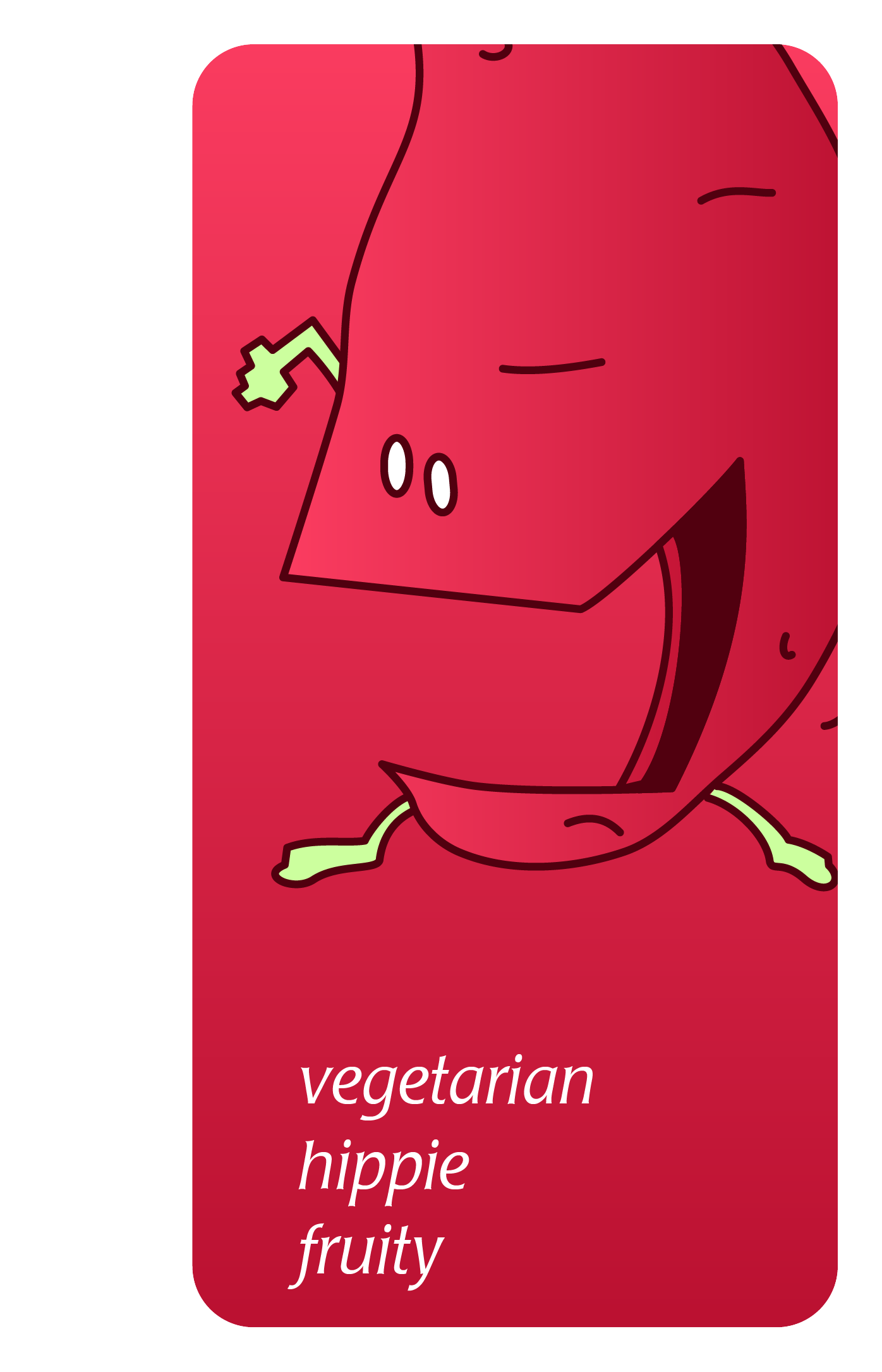
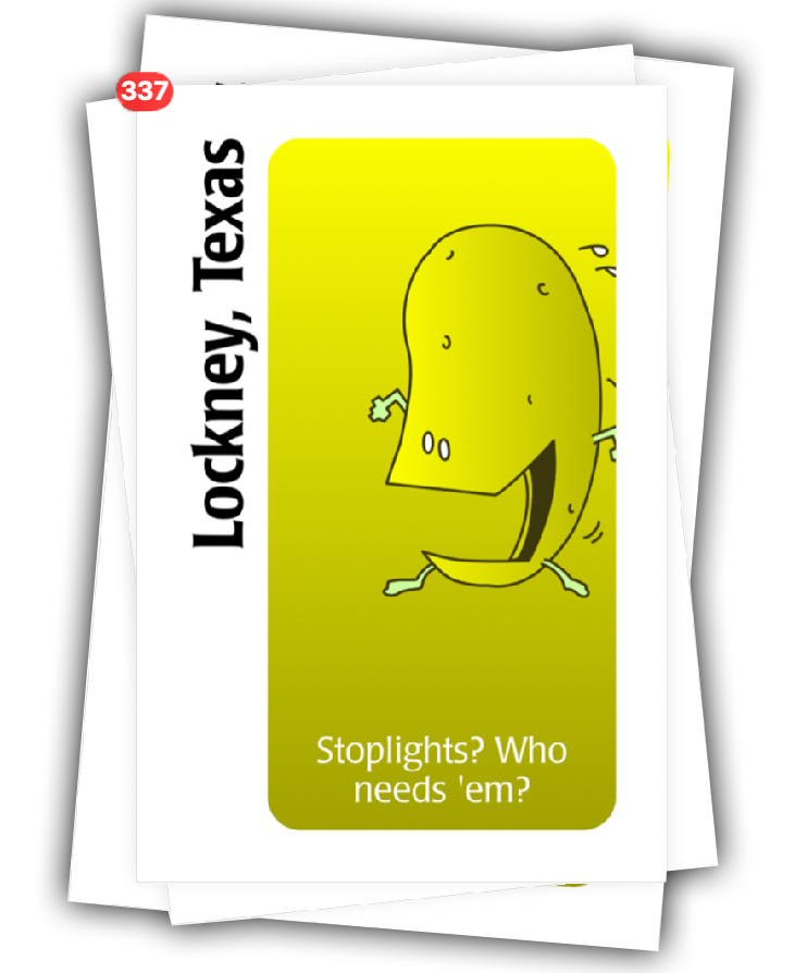
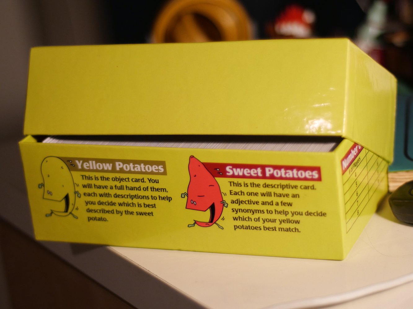
In the previous iteration, when I cropped the potatoes just to the face to match the way it had been done on Apples to Apples, the potatoes became completely unrecognizable. Resizing those to be cut off by the margins of the cards still allowed for the modern look of the newer cards, but did not cut off the distinguishing part of the potatoes. I also realized the best solution for where to put instructions for the game: on the box itself!
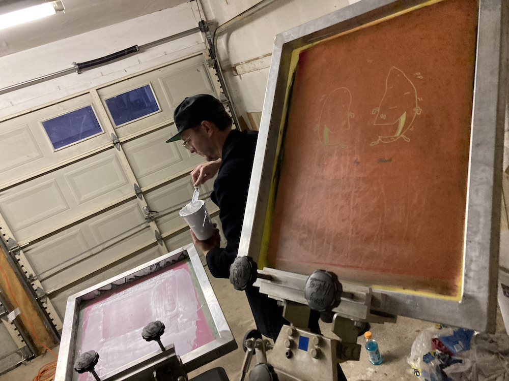
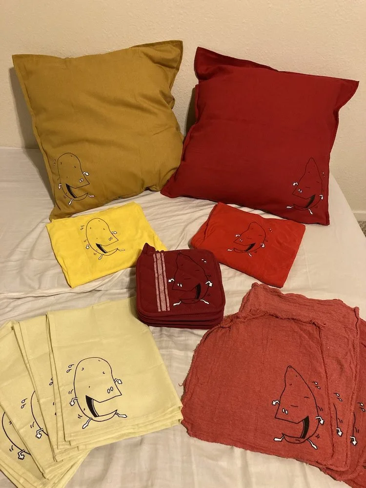
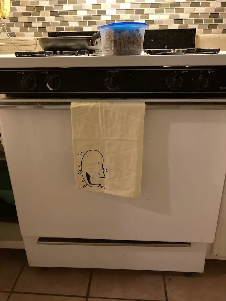
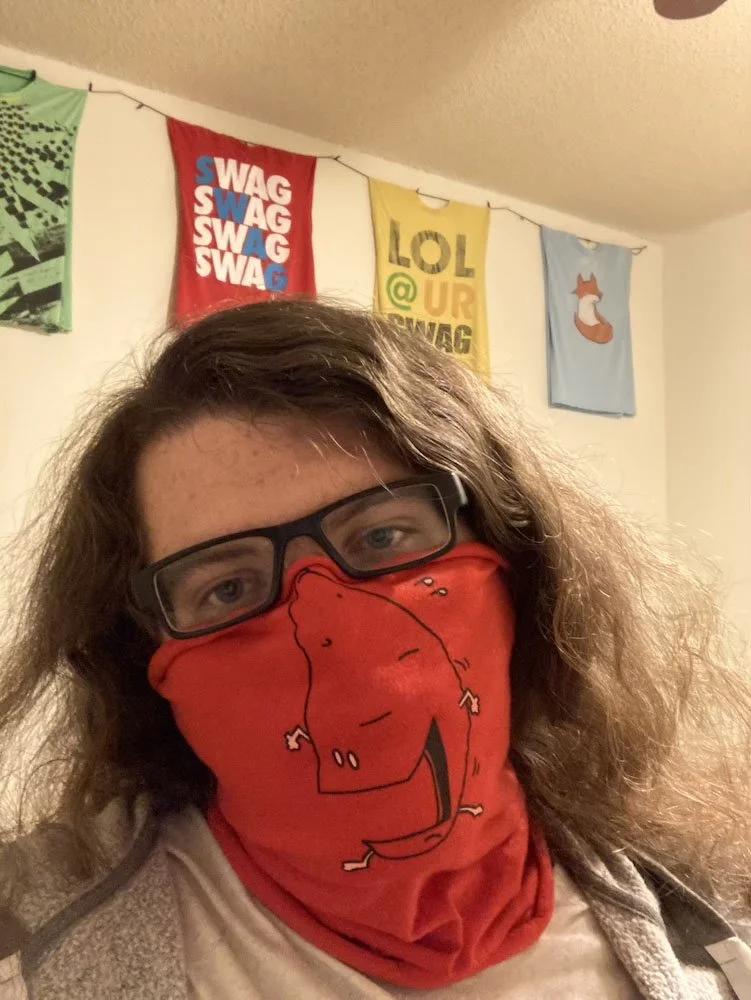
Along with the cards, I printed gifts for my family members, shout out to Ben Humphreys (@benatx) for helping me screen print them!
Reflection
This project has proven to be the gift that doesn’t stop giving. To me, it is one of the most effective designs I have ever worked on, because the design decisions themselves go completely unnoticed once the game is played. Instead of drawing attention to itself, the design simply helps make the game as easy to play as possible. I continue to play these games, and not even just with family!